
Showing posts with label words. Show all posts

Wednesday, September 10, 2008

Mango #2, and Color in Old English (Part 3)

Mango #2
7/30. Mango #2, oil on linen panel, 5x5 in. SOLD

I had long wondered what was meant by "red gold" in medieval literature. Was it, like so-called red or rose gold today, simply a colored gold alloy? If not, why was it called red? Of course, the answer to this might have to do with what the color "red" once meant.

A cursory explanation was offered by Nigel Barley in "Old English Colour Classification" (Anglo-Saxon England 3, 1974). His theory of Old English colors states that they were centered on a light-dark axis, and that a few colors had derived from ancient horse color terms (which Earl Anderson would later elaborate upon) - these special colors were normally used of "animate" things, or else to describe some other-dimensional aspect of an object's surface. But despite this over-ruling ancient "binary opposition" of light and dark, hues sometimes were distinguished, even if, on the hue axis, the Old English colors didn't line up with our modern color system. Barley gives a table, like the one below, that shows "how simple is the solution to that most perennial of old disputes in Anglo-Saxon - the use of read to describe gold" - we see that the Old English colors read and geolo once lay in different places on the spectrum from those of modern English "red" and "yellow":

..Modern English....Old English
.________________ ________________
(................!................)
(......blue......!................)
(................!.....hæwen*.....)
(————————————————!................)
(................!................)
(.....purple.....!————————————————)
(................!................)
(————————————————!.....baso*......)
(................!................)
(......red.......!————————————————)
(................!................)
(————————————————!.....read.......)
(................!................)
(................!————————————————)
(.....yellow.....!................)
(................!.....geolo......)
(................!................)
(————————————————!————————————————)
(................!................)
(.....green......!.....grene......)
(________________!________________)

*Hæwen and baso were not basic-level color words.


Barley writes, "Recourse is often had to highly ingenious and learned explanations urging that gold in medieval times had a relatively higher copper content and that it was consequently redder than modern gold. We are told that the adjective was used only for the alliteration or because it had become a set phrase. As elsewhere, such explanations lack an anthropological perspective and so fail to realize that Old English 'red' is not our red and that we cannot blandly equate the two categories." While Barley's explanation considers the "variation from culture to culture in the position of boundaries," Earl Anderson suggests we also determine the possible focal point of the color red in Old English. He writes,

The virtual universality of 'red' as a semantic category is a linguistic by-product of the artistic and ritual use of ocher among primeval human cultures the world over. Ocher is a clayish soil containing hydrated oxide of iron, with colors that include yellows, reds, and browns. Iron ore is found also is found in the purer forms of red hematite and yellow-brown limonite. Ocher, hematite and limonite in pulverized form often were used as pigments by ancient man. The colors of these ores can be intensified and darkened by heating them and by mixing them with water or with some other liquid.... The material culture, ... considering the early importance of ocher in it, may very well be the motivator of 'red' as a basic color term in languages around the world.

"Contributing to the reputation of 'red' as the color par excellence is the extraordinary stability of *rudhró- (together with its northwest variant *rowdhó-) in the Indo-European languages," he says; *rudhró- possibly is a loanword from Sumerian urudu 'copper' from Sumerian *burudu, "which gave the Euphrates river its ancient name[.]" The connection to copper or ore can be found in Latin raudus, pl. rudera "piece of copper, copper coin," Russian ruda "ore." *Rudhró- is found in the Greek erythros and Latin ruber. The variant *rowdhó- appears in Baltic, Celtic, and Germanic languages, e.g. Lithuanian raudas, Old Irish ruad, Welsh rhudd, Old Norse rauðr, and Old English read (and noun rudu "redness").

Anderson goes on, "In the Iliad, [erythros] is used for the color of copper as well as of blood, wine, and nectar.... For speakers of contemporary European languages, 'red' has its focal point in the color of fresh blood. We should take care, however, not to project this intuitive knowledge of red onto languages other than our own, for blood, copper and ocher all are possible candidates as the material basis of red." So red might have been more earthy than we are used to today (and possibly why Aristotle was against
describing the dawn as erythros). The problem of "red gold" is made more puzzling, says Anderson, by the fact that "gold" (Germanic *gelto-) was derived from "yellow" (*gelwoz), but that it is

modified by 'red,' not by 'yellow' until later medieval times. [The 14th-century poem Wynnere and Wastoure has the phrase ȝalowe golde.] This certainly differs from the situation in the sixteenth century, when Thomas Cooper (1578) defined the verb flaveo, 'to be yelow, or of colour lyke golde,' and ... when Samuel Johnson, in his Dictionary (1755), defines ruddy as 'Approaching to redness,' and then gives, as a second meaning, 'Yellow. Used, if at all, only in poetry.' Johnson was thinking of Dryden's line, 'A crown of ruddy gold inclosed her brow,' a relic reminiscent of the Old an Middle English ways of describing gold, which by the eighteenth century had become forgotten to the extent that he didn't know what to make of it.

The modifying phrases used in Old Norse are raut gull 'red gold' and bleikt gull 'bright gold' (cf. OE blac [easily confused with blæc "black"]); Old Norse also has raud mani 'red moon' and et rauða 'egg yolk.' Among the twenty-eight times that read- is used in Old English poetry, the phrase read gold appears four times. Read- modifies gold about twenty-one times in the Old English corpus, and it modifies blod about twelve times.... Among the fifty-four times that rot 'red' appears as the most frequent color word in the Middle High German Nibelungenlied, eighteen times it modifies golt.


Anderson discusses the proposed solutions to this puzzle:

(1) The meaning of "red" was indeterminate. Some in the 19th century believed that primitive Germanic peoples had an underdeveloped capacity to see color, hence "red" could be used to describe gold. But this doesn't explain why gold could not also have been described as "yellow."

(2) "Red gold" was merely a poetic convention. This theory, mentioned by Barley above, was just an extension of another 19th-century idea that the severely limited palette of the Iliad and Odyssey was a stylistic choice. "It is true that read gold is a verse formula, always appearing as a b-verse in Old English poetry; but beyond the poetry, read modifies gold sixteen times in prose or in glosses ... [and those examples] are not confined to any one formula. Moreover, the phrase 'red gold' continues to be used in Middle and early modern English, long after the potential influence of oral poetic tradition."

(3) Also mentioned by Barley is the theory that the gold of the Middle Ages "was often darker than that of our own, and contained a considerable alloy of copper," as W.E. Mead wrote ("Color in Old English Poetry," 1899). Anderson says that gold objects from medieval China do tend to have a reddish color, and that in Europe, since the time of the late Roman Empire, "the gold used in coinage often was alloyed with copper, but this was not normal practice for gold used in manuscript illustrations and for jewelry or precious objects." Although Anglo-Saxons only rarely used gold in manuscript illustration before 900, "[later] artists sometimes used it generously, and when they did, they used highly burnished gold, not only for incidental details, in a picture, but non-naturalistically to sectionalize or unify or frame a picture, and to brighten it." And while an inventory of Anglo-Saxon metalwork would indicate a number of gold-copper alloy objects, Anderson believes that

the Anglo-Saxons were more likely to safeguard the integrity of gold because of its greater value. In some prose texts, indeed, read as a color-modifier suggests the purity and brilliance of gold rather than its adulteration with base metals. This is the case with an anonymous homily De sanctio Iohanne:

Þu gelitenest swa read gold, ealra fugela king, Fenix gehaten
[You shine like red gold, king of all birds, called Phoenix]

... and again [in Ælfric's Catholic Homilies I] when St. John transforms a bunch of green branches into golden rods:

ealle þas goldsmiðas secgað þæt hi næfre ær swa clæne gold ne swa read ne gesawon
[all the godsmiths say that they never before had seen gold so pure and so red]
(4) L.D. Lerner, in "Colour Words in Anglo-Saxon" (Modern Language Review 46, 1951), had said that read was one of several color words (including brun, græg, and fealo) relating to brightness (or shininess?) rather than hue - so that read gold really meant "bright gold." This was just a revival of the theory that primitive peoples had a limited "color sense," and of theories like Mead's which describe an ancient preoccupation with light-dark contrasts - so that hwit often meant "bright" instead of "white"; brun when applied to metal meant "bright" with, as Mead says, "a suggestion of redness"; fealo of weapons meant "bright" and slightly yellow; etc. Barley argues the same point when he writes that the color system stressed brightness over hue. But, says Anderson,
However this may be, the range of referents modified by read in Old English is such that the word in itself could hardly imply 'brightness,' although it is true that bright things, like the sun or the sky or gold, and maybe even blood and wind, could be red. Among the items often described as read in charters are topographic features such as rocks or stones, especially boundary stones (17 occurrences), cliffs (7), ditches (8), a ridge (2), a path or road (14), a slough or wallow (7), a spring (5), stream (6), ford (7), or pool (3). Read, when applied to these referents, evokes an earthen or mineral color.
(5) Barley's solution, as we saw above, was that the places "red" and "yellow" occupied on the color spectrum were different from where we would put them today, so that gold was called read and not geolo.

(6) Another possible solution is the theory that

'red,' the color par excellence, has a close semantic association with 'color' in the sense of a 'covering,' exemplified by gilt, paint, or, in paleolithic and neolithic times, by fine red ocher dust sprinkled over a body in a funeral. In the phrase read gold, the essential idea is that gold is a covering; its chromatic value is secondary. For this reason, 'red' is preferred to 'yellow' as a modifier for gold ... In some languages, it is true, the taxonym for 'color' also means 'red': ... [e.g] Spanish colorado 'reddish.' In ancient and medieval Europe, red was a symbol in malo of evil, of the devil, and of a dreadful disease called "St. Anthony's fire" in the Middle Ages and Renaissance ... whereas in bono, red had protective power against evil.... According to this line of reasoning, red, as the color of blood, has a special association with sorcery or magic or the supernatural or the universal life-force and thus could extend to gold, the best of all metals.
But, although English "color" was a loanword from Latin color (rooted in celare 'to conceal'), the "closest semantic counterpart to color in Old English ... is hiw, which means 'color,' 'shape,' or 'appearance' but not 'covering.'" And with regard to magic or a universal life-force, Anderson says
the symbolic role of blood is ambiguous in medieval iconography. The wine ceremoniously consumed at communion symbolizes and becomes Christ's blood, shed at the time of the crucifixion as the basis of mankind's salvation. On the other hand, it is a medieval scientific commonplace concerning the blood of animals that 'heora blod is heora lif' [their blood is their life (Ælfric's Catholic Homilies I)], in contrast to human beings, for whom life consists in the soul rather than in blood. There is, after all, then, no particular connection between 'red' and sorcery or the supernatural in Old English.

Of these six possible solutions to "red gold," Anderson says that Nigel Barley "is right if all he means to say is that the Anglo-Saxons thought of gold as read rather than geolo." Anderson suggests a "larger theory," that

Old English read and its early Germanic cognates preserved the semantic range of Indo-European *rudhró: the colors obtainable through the artistic preparation of ocher and hematite: red, reddish brown, orange, and reddish yellow. The reason for 'red gold' rather than 'yellow gold' is, quite simply, that read is mainly earthen, mineral, or metallic in its focus, whereas geolo focuses mainly on the colors of vegetation, and resembles grene in this respect.

The conceptual challenge that 'red gold' offers has two parts: the semantic range of 'red' is comparatively restricted compared to Old English read. 'Orange,' 'pink,' 'purple,' and 'gold' are basic colors in contemporary English, and thus are sharply differentiated from 'red.' In Old English, in contrast, these colors belong to the semantic range of read.... Leaving aside the biblical hydronym read sæ [Red Sea] which is just a translation of Mare rubum, the most frequent referents are topographic features such as cliffs, rocks, ridges and paths, streams, ditches, pools, mires and wallows, and herbs and nettles. The referents include blood, apples, peppers, grapes, clover, lips, the uvula, bodily wounds, and, of course, gold.

Anderson notes that information about relative frequency doesn't say much about the focality of read, but rather the subject matter of the material in which we find the word: the read paths and boundary stones mentioned in charters, the colors used in scientific texts, and the many references to the Red Sea in religious works are all "out of proportion to the probable use of read in the ordinary speech of the Anglo-Saxons. With respect to semantic range, however, [this information] encourages the belief that 'earth tones' are a canonical part of read."

In modern English, as noted earlier, the focal point of 'red' is something like the color of fresh blood, therefore we may tend to think that blood was the prototypical referent of 'red.'

It is quite possible, however, that the prototypical referent of the Indo-European word for 'red' was ocher, the earliest mineral-based pigment to be used universally by mankind. OE read was, in other words, essentially an earthen color, at least originally. The possible focal points include reddish brown, orange, and reddish yellow; the bright red of fresh blood is possible but improbable. At some early point in their history, the Indo-Europeans learned the use of copper as it spread from Sumer to other parts of the Fertile Crescent and beyond, and at that time, ocher may have been displaced by copper as the focal point of 'red'; this new foreign influence on the material culture may have found expression, as well, in *rudhró- based on the same root as Sumerian urud 'copper.' No doubt the focal point and range of this word varied in time and place among Indo-European dialects, affected by changes in the material culture such as the introduction of shellfish or plant-based dyes and advances in medical and metallurgical technologies. It is impossible to prove that the focal point of OE read was something other than the color of blood, but two arguments favor this position:

(1) Of more than 260 appearances of blod- in Old English texts, it is called read fourteen times, and once rudig. Read is the color word most often used to modify blod, but fah~gefah, and sweart are also used....

(2) In the Old English Lapidary ... periphrastic descriptions of the blood-like colors of sardonyx [blode licost "most like blood"] and sard [luttran blode gelic "like clear blood"] are used, rather than read. If fresh blood were the prototypical referent of Old English read, one might have expected a phrase like *read blode gelicost, or possibly blodread which appears four times in Old English ...

These arguments are inconclusive, at best suggesting that we cannot draw firm conclusions about the focal point of OE read. It is possible that read has two focal points, one the color of freshly drawn blood, and the other a mineral color like gold - just as modern English blue has two focal points. We cannot be certain about that, but we can be certain that read was a basic color word whose semantic range included red, orange, pink, gold, and purple.

Wednesday, September 3, 2008

Color in Old English (Part 2)

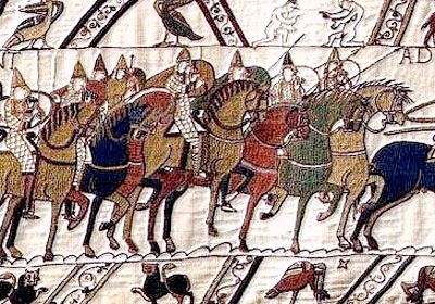
A Norman elite troop rides out to meet King Harold in battle. From the Bayeux Tapestry, c. 1077

It's interesting that until after the Norman invasion, the word "color" did not exist in English. Earl Anderson says, "Many languages do not have a taxonym for 'color': an example often cited is Zuni[.]" In English, the concept of color "was not fully lexicalized until the thirteenth century, when colur~colour was borrowed as a loanword from French.... [but it] was well established in English by the time of Chaucer[.]" Old English hiw, "hue" in modern English, "can mean 'color' but more often means 'appearance' or 'shape,' and bleo sometimes means 'color' but more often has the same meaning as Latin discolor [having many colors]." Along with fah, these were the English words for color, here with Anderson's attempts at differentiating them:
hiw - shape, appearance, as well as color
bleo - complexion, appearance, and form as well as color
fah - stained, guilty, criminal, shining, and variegated as well as colored
The poet of The Phoenix, "in a sequence of two verses, uses all three terms for color:
Is se fugel fæger__forweard hiwe,
bleobrydgum fag__ymb þa breost foran.
[The beautiful bird is foremost in color (or: appearance or shape), colored (or: adorned) with variegated colors in front, around his breast.]"
Of course, while there was no taxonym in the language for "color," there was always the underlying concept. This Anderson says was a "covert category" (a term first described by Benjamin Whorf in 1937) - for instance, to modern English speakers moths and butterflies belong in one category, bees and wasps and hornets to another. "English has no terms for these residual categories, yet they exist in the language as nonlexicalized, covert categories. Color is such a category in many languages around the world."

So, what about the actual color names themselves? After exhaustive reconstructions of the color taxonomies of Proto-Indo-European, Greek, Latin, and Germanic, Anderson concludes that Old English had (like Germanic) six basic color terms:
BLACK - sweart, with the innovation of blæc as a rival synonym
WHITE - hwit
RED - read
GREEN - grene
YELLOW - geolo
GRAY - græg
Such a limited color system may feel alien to us - note the lack of "blue" (compare traditional Japanese with its category covering green-and-blue, or "grue"). But we must remember that this doesn't simply mean an all-inclusive color spectrum chopped up into smaller segments. More from Anderson's discussion of "focality as a perceptual aspect of color":

It is a misconception widely held that cross-linguistic variation in color vocabularies results from differences in the ways 'color space' is divided from one language to another. The chromatic spectrum, according to this view, is a continuum without breaks, but languages use basic color words to divide up the spectrum in different ways. If this were so, we should expect speakers of a given language to agree as to the 'boundaries' between one color and another. This was not the case, however, in tests in which speakers of American English and Dani were asked to identify an assortment of color chips as exemplifying one color or another. Neither the Americans nor the Dani could agree among themselves as to the boundaries between yellow and green or green and blue [Eleanor Heider, "Universals in Color Naming and Memory," Journal of Experimental Psychology 93, 1972]. This leads to the conclusion that the boundaries between one color and another are idiolectic [different from person to person]. As Mead observed seventy years earlier, 'Most of us have a very limited color vocabulary, and we differ hopelessly in our terminology as soon as we move away from a few sharply defined colors[.]'

The mention of William Mead is interesting because of the role his paper ("Color in Old English Poetry," Publications of the Modern Language Association of America 14, 1899) undoubtedly had in perpetuating the idea of Old English color words denoting an aspect of surface shine or brightness. Mead correctly notes the "comparatively small number of genuine color-words," and the tendency toward light-dark contrasts - pointing out that, interestingly, read, which he calls the "strongest and most effective" color, is not found once in Beowulf. But he asserts that the "remarkable fact about a great number of the Old English ... color-words, is that they are so indefinite in their application as scarcely to permit us to decide whether a color-effect is intended or not." After brief examinations of them, Mead sometimes gives in to the notion that they mean no real color at all - or that, perhaps as in the case of read, their occurences are the result of poetic convention (I'll eventually have to get back to this brightness/shininess business later). But Anderson goes on,

What Mead was getting at [in saying "we differ hopelessly in our terminology"], putting his native speaker intuition to good use, was the primacy of color focalities rather than color boundaries. The notion of color vocabulary as the arbitrary division of color space is disconfirmed by our own experiences.

... [F]or any given language, native speakers agree on the names and focal points of canonical colors. The hypothesis of focal colors was tested by Heider ... who, in the series of experiments alluded to earlier consulted twenty speakers of American English, and twenty-one speakers of Dani, a language that has only two basic color terms, mili for 'brightness' and for 'warm' colors and mola for 'darkness' and for 'cold colors' ... In one experiment, English and Dani informants were presented with color chips that exemplified both saturated or 'pure' colors and unsaturated colors, and were asked to recall the colors. In another, the Dani were asked to learn names for both saturated and unsaturated colors. In these tests, ... both Dani and English speakers named the saturated colors more rapidly, and gave these colors shorter names, compared with nonsaturated colors. Select saturated colors, therefore, are marked as 'focal,' and their focality influences cognition, for Dani speakers as well as for speakers of English, even though Dani has no chromatic color terms.

Anderson turns to a little puzzle from ancient Greek (italicized Greek words that follow are my transliterations): "Let us state the problem of color space versus focality another way. A basic color term is not just a larger 'color space' in whose territory are located specialized color terms with smaller semantic spaces. In the logic of the spatial metaphor, we would want to represent the relationships of the ancient Greek words erythros 'red,' phoinikos 'purple, Phoenician red, crimson,' and rhodos 'rose, rosy'" as in the following diagram:
.___________________________________________.
(...........................................)
(...............ERYTHROS "RED"..............)
(..._________......__________......______...)
(../phoinikos\..../porphyrios\..../rhodos\..)
(..\"purple" /....\"porphyry"/....\"rose"/..)
(___________________________________________)

"It is natural to think of erythros, the basic term for 'red,' as occupying a large semantic space in which phoinikos and rhodos are located as smaller spaces. We would probably want to think of the relationships among modern English terms for 'red' in the same way ...":
.___________________________________________.
(............._______.....________..........)
(.._________.( gules )...( russet ).______..)
( ( scarlet )......................( rust ) )
(..____________.......RED...........______..)
( ( vermillion ) ______..._________( roan ) )
(...............( lake ).( crimson )........)
(___________________________________________)

"Most native speakers of English would agree on the essential correctness of [the second diagram] as a way of representing the variety of terms for 'red.' By analogy we infer that [the first diagram] represents the relationship among ancient Greek terms for 'red,' but a diagnostic text demonstrates the inadequacy of the 'semantic space' metaphor as a way of representing the meanings of color terms." He adds that our first diagram does not hold up to the analysis, in Aristotle's Rhetoric (4th-century B.C.), of the phrase

'rosy-fingered dawn,' based on the verse formula rhodo-daktylos eos in the Iliad.... In a discussion of diction as an aspect of style, Aristotle notes his disagreement with the sophist Bryson, who says that there is no such thing as bad word choice because one synonym will do as well as another in cases where words have the same referent. Aristotle argues the contrary ... In the case of metaphor, well chosen words are

beautiful to the ear, to the understanding, to the eye or some other physical sense. It is better to say, for instance, 'rosy-fingered morn' (rhodo-daktylos eos) than 'crimson-fingered' (phoiniko-daktylos), or, worse still, 'red-fingered morn' (erythro-daktylos).

One could argue Aristotle was only thinking of the sound of the words [that is, that rhodo-, already part of a Homeric verse formula, was better for having only two syllables and not three like phoiniko- or erythro-] ... But this does not explain why Aristotle regards erythro- as the ugliest of all possible substitutions that he can think of, and this should give us pause, for Aristotle is a reliable witness, and erythros is the basic color term for 'red.' Come to think of it, whenever Aristotle, in Meteorologica, has occasion to refer to redness in the sky, he avoids erythros, using specialized terms such as phoinikos or porphyrios ... and he avoids metaphorically-derived terms such as aimatode chromata (blood-(red) colors) ... For Aristotle, erythros was not a color term that one used in a meteorological context, and for this reason, 'red-fingered dawn' was not available as a possible substitution for 'rosy-fingered dawn.' ... In their analyses of rainbow colors [which is a whole other discussion], Aristotle and Xenophon use phoinikos but not erythros, although a century after Aristotle (c. 260 B.C.), Poseidonios uses both phoinikos and erythros. Perhaps erythros in earlier Greek was focalized on a mineral color, like that of red bricks or iron ore or ocher. Whatever the precise solution to this problem might be, Aristotle's discussion of 'rosy-fingered dawn' illustrates that basic color terms must be thought of in terms of focalities; 'red' is not a genus that incorporates all supposed hyponyms.

Anderson's possible solution to this puzzle takes into account the material origin of basic color names. Also, "Languages maintain specialized subsets of color words that relate to particular domains within the material culture" - horses, cattle, and fabric being some of these subsets. Some languages of East Africa "have two dozen or more color terms that apply only to cattle. Colors applied only or mainly to horses are characteristic of the Altaic languages, viz. Kirgiz, Mongol, Uzbek, and Turkish.... Old French has thirty-nine words that apply only or mainly to animals, and twenty-four words that apply only to horses[.]" Sometimes a "specialized horse or animal color or a fabric color [can] become a basic color by sliding from a specialized semantic role upward to a Level I taxonomic slot." Old English purpur ("purple" in modern English) was originally used only of fabrics; Germanic *brunoz (English "brown" and French brun) was once used only of animals, and the "Germanic horse term *blanka- displaced Latin albus as the basic word for 'white' in Italian bianco, French blanc, and Spanish blanco."

These specialized terms are the crux of another puzzle, from the Old English Prognostics - "where the writer interprets the meaning of dreams about horses of different colors:
Gyf mon mete þæt he hwit hors hæbbe oððe on ride, þe byð weorðmynd.
Gyf him þince þæt he on blacum horse ride, þe byð his modes angnes.
Gyf him þince þæt he on readum horse ride, þe byð his goda wanigend.
Gyf him þince þæt he on fealawan horse ride, þæt byð god, oððe grægan, þæt byð god swefn.

[If someone dreams that he owns a white horse or rides on one, that means honor. If it seems to him that he rides on a black horse, that is anxiety of mind. If it seems to him that he rides on a red horse, that is waning of his property. If it seems to him that he rides on a fallow horse, that is good, or a gray one, that is a good dream.]"

Carole Biggam (in Grey in Old English, 1998), says Anderson, "first noticed the semantic puzzle of horse colors in this passage: it deviates from its Latin source, where the colors are albus (signifying a good event), niger (signifying anxiety), baius (signifying an expedition), castaneus ('dark red-brown' signifying a horrible business), and flavus (signifying a loss). Both the Latin and English versions have five horse colors, but the English version omits baius, a word for which Old English has no true counterpart,* and adds græg at the end" - perhaps because, to quote Biggam, "the translator appears not to believe that the list could have omitted a græg horse."

An attempt to match up the two groups of color words does not work:
Latin ......Old English
albus.......hwit
niger.......blacum
baius
castaneus...readum
flavus......fealawan
............grægan
The key to this puzzle, Anderson says, is the "role of Old English horse colors as classifiers" - that is, like red and white when speaking of wine, they don't function as general descriptors of color. The fact that some of these colors also happen to be basic-level color names is what is misleading. The mismatch between the Old English passage and its Latin source is "understood more readily when we realize that Old English has five canonical horse colors, used as classifiers": hwit (or also blanca, used as a substantive meaning "white horse"), blæc, read, fealu (or fealwe), and græg. "The Anglo-Saxon Prognosticator, in making his list of five horse colors, was not translating color descriptors from Latin; rather, given a list of Latin color terms that were more or less suggestive of the English horse-categories, he matched the Latin colors with English categories as best he could."

Which takes us back to the Bayeux Tapestry, now believed to have been constructed in England by English artists. In it Anderson sees "indirect confirmation" that the horse color words (tracing back to old horse words like *blanka- and *falwa-) functioned as classifiers, not just as descriptors:

The approximately 152 horses in the tapestry are all monochromatic, in five hues that range from light golden yellow to blackish brown, representing Old French sorel 'golden yellow,' fauve 'brownish yellow' (cognate of OE fealu), ferrant (from Latin ferron) 'iron gray' with a blue coloration, bai (from Latin badius) or baïart 'reddish brown,' and noiron 'blackish brown.' These colors are used, as well, as the proper names of horses: Sorel, Fauvel, Ferrant, Baiard, and Noiron. In several tapestry scenes, horses in groups of four are differentiated from each other by colors and in these cases the colors usually are sorel, fauve, bai, and noiron. A horse ferrant is seen less often, and then as part of a pair, partnered with either sorel or fauve. Color terms are used in Old French, then, as in Old English, to classify horses, not merely to describe them, and the semantic influence of French color-classifiers is so strong that it gives rise to the proper names of horses and it allows for the non-realistic coloring of horses in the Bayeux Tapestry.

__________
*[Anderson's note:] Alternatively, the Anglo-Saxon Prognosticator may have thought that OE readum covered the same semantic space of both baius and castaneus.

Saturday, August 23, 2008

Elephant Garlic, and Color in Old English (Part 1)

Elephant garlic
7/13. Elephant garlic, oil on linen on panel, 5x5 in.

Lately as I struggled to mix the right colors - say, decent shades (or tints?) of neutral gray - I would think about what I "knew" so far of how English-speaking people a thousand years ago would have thought of colors. I had a vision of their world (or the world they wrote about) that was tainted by all I had read on the subject, and I'd accepted the view put forth by some scholars that Old English color terms not only stressed brightness over hue, but also denoted aspects of surface texture or reflectivity. Basic-level color names then were taken to mean also dull or glossy or shining or glimmering, and so on and so on - to the point that I carried around this image of an "ideal" Anglo-Saxon world that was in half-shadow yet had very clear glints here and there of spearpoints, flickering sword edges, and dull-gleaming helmets - a diorama whose details were sharply defined though kept at an unfathomable distance behind layers of dark, honeylike varnish. Just reading about anything related to Old English felt like focusing a microscope on an amber-encased world of smoky, raucous mead halls on one hand and silent, glittering swans on the other; a world of shimmering gold and ivory contrasted against bloodstains and dark, colorless ocean.

So in that world, somehow "brown" (brún) when talking of metal could also be translated as "shining" or "bright" or "flashing," the actual hue of a brown (and dark) sword often being disregarded even by some recent translators in favor of some shine-oriented meaning. Examples from Beowulf:

seax getéah / brád, brún-ecg
"drew her knife, broad and bright-edged" (E. Talbot Donaldson, 1966)
"pulled out / a broad, whetted knife" (Seamus Heaney, 2000)

sío ecg gewác / brún on báne
"the edge failed, bright on the bone" (Donaldson)
"the blade flashed and slashed" (Heaney)

brún-fágne helm
"the bright-shining helmet" (Donaldson)
"the burnished helm" (Heaney)

How could the color brown, which was often used as a synonym for dark even into modern English, also mean bright? (It was just part of an evolutionist theory of color perception, as I'll get to below.) One etymological explanation was that there might have been confusion at some point in the evolution of the Germanic word with a similar sounding verb meaning "to burn/fire," which could have resulted in brún having two opposite meanings. But if, as in these examples, the word suggested that objects of weaponry and armor had been burned or fired, then the resulting appearance would still be dark and not bright. A more down-to-earth explanation is that brown actually described the dark coating on steel that had undergone the process of "browning" to make it less vulnerable to rust. So it seems it was a hue term after all. And as it does today, brown ranged into lighter hues such as that of parchment, though it wasn't until the 18th century that it earned a place among "basic" colors and was no longer a subcategory of black.

I summarize this last bit from a great book, Earl Anderson's Folk-Taxonomies in Early English (2003), which is chock full of this kind of semantic analysis - I love the interlibrary loan system, by which you can get your hands on expensive books on arcane subjects for only the cost of postage, like it was a movie from Blockbuster; and Google Books, where I found the book in the first place (and where you can
read much of it for free). I can't go too far before it just shows my need to read more, but for background I'll attempt to paraphrase some of it here.

Anderson defines a folk-taxonomy as "a hierarchical semantic system that lexicalizes a domain in human experience or in nature, such as colors, plant and animal life forms, seasons of the year, directions, or the senses." So, speaking of the semantic field of color (as our culture thinks of it), at the top of the hierarchy would be the taxonym, or general term, "color." At Level I are the so-called basic color terms, followed by Level II secondary color terms, Level III specialized colors, and so on. Following Anderson's example:
(0) Taxonym - color
(1) Level I, basic - black, white, red, green, yellow, blue, brown, gray, purple, orange, pink, and possibly silver
(2) Level II, secondary -
crimson, scarlet, vermillion as species of red
maroon as species of red or brown
magenta as species of red or purple
aquamarine, turquoise as species of green or blue
etc.
(3) Level III, specialized -
Compounds like blue-green, red-orange, etc.
Comparative expressions like ash(-gray), chestnut, fireman-red, mahogany, etc.
Terms restricted to specialized semantic fields, like auburn, blonde, brunette; bay, palomino, pinto, roan, sorrel; ruddy, sallow, wan, etc.
(4) Level IV, more specialized, commercially coined terms used in automobile, cosmetics and paint industries, etc.
We are familiar with the notion of a supposedly "scientific" and unbiased color space representing hue, brightness, and saturation, but as Anderson sees it, "The scientific account is really just a refined elaboration of the modern western European concept of color." He adds that terms such as "piebald, pinto, and palomino cannot be described in terms of the scientific account of color. The expected response to this objection is that these are the names of patterns, not colors, but this is really only a way of marginalizing data that are inconsistent with a preconceived theory." He cautions that when trying to interpret an unfamiliar color system, it may not always be possible to make neat correllations to our way of seeing: "It might be misleading to assume that color terms in Old English are always lexicalizations or 'mappings' of the canonical trinity of hue, brightness, and saturation."

According to "mapping" theory, "languages are 'maps' of reality, and, although these 'maps' may differ from each other, they all relate to the same reality." Such a theory "assumes the intertranslatability of languages, such that anything said in one language can be said in another" - but anyone who knows a second language or has tried to translate between the languages of significantly different cultures knows this isn't true. Anderson therefore suggests that a language works not as a map of our universe, but of a sort of parallel universe. "Words do not relate directly to things as symbolic mappings, but they relate to each other in semantic patterns and systems that are approximately parallel to the interrelation of things in reality." We may also believe in the sufficiency of our language, but, however large a language's color vocabulary, there will always be a "poverty of names;" no language is sufficient enough to communicate everything and leave no semantic gaps.

To the hue-brightness-saturation color model, Anderson adds a fourth aspect: "focality." Folk-taxonomies (colors, plants, animals etc.) aren't all-inclusive hierarchies "capable of 'containing' all conceivable instances of a given category." Although, like scientific taxonomies, they are attempts to impose order on a messy world, they belong to linguistics and not science. He argues that the mind is less like a container and more like a searchlight, so we seek the places on which to focus. Focalizations vary across cultures, and across time, as the result of changes in material culture and the influence of other languages. Some cultures today focalize more or fewer basic colors than we do, and Anderson notes for example that Russian has two basic terms for blue, a "dark blue" and a "sky blue," both having equal significance in the color taxonomy (i.e., neither is a subcategory of the other); Hungarian has two reds, "a light red with a focus on orange-brown" and "dark red with a focus close to purple." Many cultures have what we call macrocolors, or more than one color categorized as one - the Dani people of Papua have only two basic color terms, a "macroblack" and "macrowhite."

Anderson says, however, that "the scientific account [of hue-brightness-saturation] is an excellent representation of concepts underlying the folk-taxonomy of color in modern English." So it is useful to us as a means to compare, e.g., the Old English color system with our modern English one. But again, we go wrong if we think that our only problem lies in matching names. That is, despite the familial relation between modern and Old English, our modern map* isn't congruent with the old one.... And this takes me back to what I had previously considered true about Old English colors. Today it is still assumed that the Old English terms stressed the colors' brightness/darkness or surface components, but why was that? And, on the other hand, so what? - I mean, how does changing from this incorrect interpretation ultimately affect how we see their colors?...

__________
*On the subject of maps, it is interesting to see how the Enlightenment gridwork system of cartography used by Lewis and Clark differed from the method used by the Indians they encountered. One system gives a direction-oriented and supposedly all-inclusive view from above, the other a route-oriented diagram showing many directions at once as well as relative distance and the importance of landmarks encountered along the route (features shared by today's subway diagrams).

Saturday, January 26, 2008

On translation, part 2 of 2

Poetry must pose a different problem, because of the limits it imposes, and here I’ll visit Old English. Perhaps the modern “classic” version of Beowulf is that of Burton Raffel from 1963, published by Penguin. In 2000 Norton published a new translation by Seamus Heaney. The latter, interestingly, is more flowery and elegant than the former. I’m not sure which I prefer, as both versions veer widely from the original in places (which could be necessary for readability, due to the strangeness of Old English structure), though I haven’t taken the time to examine their differences. Personally, I think most translations of Old English have too much extra “stuff.”

What follows is a short passage describing Beowulf’s triumphant display of the monster Grendel’s hand, which ends with quite possibly the most visually powerful lines in Old English. First is the original, followed by a fairly literal attempt by me, then Raffel’s version, and finally Heaney’s:


               Hæfde Éast-Denum
Géatmecga léod gilp gelǽsted,
swylce oncýþðe ealle gebétte,
inwidsorge, þe híe ǽr drugon
ond for þréanýdum þolian scoldon,
torn unlýtel. Þæt wæs tácen sweotol,
syþðan hildedéor hond álegde,
earm ond eaxle – þǽr wæs eal geador
Grendles grápe – under géapne hróf.


               To the Danes
had the prince of the Geats fulfilled the boast -
such grief! - he avenged it all,
the wicked sorrow which earlier they endured.
And for the torture they were forced to suffer,
no small wrath! Here was clear proof
since the battle-brave one had laid down hand,
arm, and shoulder - there it was all together,
Grendel’s grasp, under the gaping roof.


               the Danes
Had been served as he’d boasted he’d serve them; Beowulf,
A prince of the Geats, had killed Grendel,
Ended the grief, the sorrow, the suffering
Forced on Hrothgar’s helpless people
By a bloodthirsty fiend. No Dane doubted
The victory, for the proof, hanging high
From the rafters where Beowulf had hung it, was the monster’s
Arm, claw and shoulder and all.  [Raffel]

               The Geat captain
had boldly fulfilled his boast to the Danes:
he had healed and relieved a huge distress,
unremitting humiliations,
the hard fate they’d been forced to undergo,
no small affliction. Clear proof of this
could be seen in the hand the hero displayed
high up near the roof: the whole of Grendel’s
shoulder and arm, his awesome grasp.  [Heaney]


I don’t think mine is too bad. Almost more concise than Heaney’s, but I wasn’t trying to match [edit: I should say outmatch] the poetic feel of the original, and nor could I possibly. Translators of Old English poems usually try to create a more fluid read, yet still match as much as they can the bang-bang, hammering hammer of consonance/alliteration that is the poems' major characteristic, but it usually comes off as forced. Most of the time I get the sense that it’s done for the benefit of readers who may not otherwise be familiar with just how much alliteration is in the originals, and that’s ok. When it’s done well it can really sing, but I wonder if they could capture the tone better by mimicking more subtly. The structure of the Old English lines does (or at least should) put a limit on phrase choices, and as this casual student has found, this sort of helps – in the way that, when one is faced with the challenge of matching a difficult color, a palette’s limitations can help solve a lot of issues.

For a visual example I turn to the paintings A Seated Turk and Turk Seated on a Sopha Smoking, by Bonington and Delacroix, respectively. This is interesting because, according to the book Richard Parkes Bonington ‘On the Pleasure of Painting’ by Patrick Noon (Yale Center for British Art, 1991), Bonington painted his picture in Delacroix’s studio, perhaps in the presence of the latter’s painting which is dated maybe a year or two earlier. The Bonington piece, says Noon, “should not be considered as an attempt at imitation but rather as a translation of his friend’s composition into his own developing stylistic idiom, which was, as [art critic Théophile] Thoré conceded, more exquisite in touch and possibly more sophisticated in the command of glazes.” Just looking at reproductions I can say that that's an understatement. “Not until Delacroix’s Odalisque Reclining ... is there a parallel transparency of coloring, although both artists, with [friend Alexandre] Colin, were certainly experimenting simultaneously with advanced oil techniques approximating the visual effects of watercolor painting.”

In the book Delacroix's picture is reproduced immediately after Bonington's for comparison. In its description Noon writes that “the development of Delacroix’s oil technique from the choppy, somewhat dry handling in this picture” to a more delicate touch and exquisite coloring “must be attributed, in part, to Bonington’s mediating influence, of which Delacroix wrote ... in January 1826, ‘there is much to be gained from this chap, and I can assure you I have made the most of it.’” Bonington would die just over two years later, while Delacroix would go on to become one of the period’s great painters.

Many books show side by side two or more painters’ views of the same scene (the way the great translators’ examples (plus one by a novice) are shown above). Just pick up any large coffee-table art book. But here is an instance when one artist has interpreted another’s interpretation of a subject, if I may put it that way, and which I include here simply because I find one of them to be totally sublime – but the viewer can form his or her own opinion:


Eugène Delacroix, Turk Seated on a Sopha Smoking, ca. 1824-25. Louvre.


R.P. Bonington, A Seated Turk, 1826. Yale Center for British Art.

On translation, part 1 of 2

To make up for the lack of updates I thought I’d share some more about translation and how it relates to painting. What follows may make a poor analogy but you may find it an interesting read. (Thanks to some basic OCR software I avoided having to type out most of the quoted parts below. I hope that my inclusion of them here falls within the bounds of fair use.)

The other times I touched on this subject, I had in the back of my mind the preface to a book I bought several years ago - a translation, published in 1998 by Schocken Books, of Franz Kafka’s The Castle (Das Schloß). I confess this is one of those books I got stuck in the middle of, though not through any fault of the book’s.

In his preface the translator Mark Harman begins by saying: “W.H. Auden once said that anybody who presents a new translation of a literary classic ought to justify the endeavor – a task, he adds, ‘which can only be congenial to the malicious.’ I have no desire to malign the translations of the Muirs[.]” Edwin and Willa Muir were a Scottish couple who, Harman says, “were in Prague learning Czech while Kafka was in Silesia writing Das Schloß” and whose “elegant translations, beginning with The Castle (1930), quickly established Kafka’s reputation in the English-speaking world.”

Harman’s justification for his endeavor was that, after more than a hundred years since Kafka’s birth, it had become obvious how dated the “classic” translation was. The Muirs had a 19th-century literary sensibilty and many scholars since have complained that they generally toned down the modernness of (and maybe even misunderstood) Kafka’s original text. Plus, Harman writes, “the Muirs’ translation furthers the rather simplistic theological interpretation proposed by [Kafka’s friend and publisher Max] Brod.” From then on Harman discusses his task as a translator, giving examples of the choices he made in his attempt at “mimick[ing] the original.”

Translator’s notes fascinate me. Their process at times seems a lot like choosing the proper colors, to make this a simplistic comparison. As a painter I sometimes feel that I am doing little more than reinterpreting something that has been tackled countless times already. Change the words in Harman’s above quote about W.H. Auden from “translation of a literary classic” to “fruit still life” (or “nude” or “seascape”) and it becomes something painters might relate to - though minus the “malicious” part, as there’s no maliciousness in art. Is there? (There's triteness, but, well, that would be a whole other discussion).

The big disparity here, of course, is that “classics” don’t exist in visual art. Painters paint within genres, but generally aren’t working from the same subject the way two translators interpret the same source material, except possibly 0.01% of the time. Often we do variations of others’ work. Even so, each of us can regard certain paintings as the epitomes of their genres, and may have such an ideal in mind each time we paint a common subject – be it a Caravaggio still life, a Bouguereau, or perhaps a Turner.

Surely, to make a painting is not always to make a statement against previous painters’ treatments of a subject. It may be a simple exercise in translation. Initially I tried too hard when faced with the bright yellow-green of a tennis ball to find that same unnatural glow in paint, and I forgot that I had to use the limits of my particular “language” – paint as opposed to photographic reproduction, say, and beyond that, the limits of my usual color palette. At times we might as well be be wrestling with passages in Kafka, sharing with a translator such as Mark Harman that task of "mimicking." But how best to mimic? That is, how to be faithful without reaching the level of reportage, and how to be artful without too much artifice - how to convey what is true about the subject the way a conscientious translator would capture the truth and beauty of his source material?

Regarding choice-making, the most important examples given by Mark Harman in his preface to The Castle is the paragraph below – first is the Muirs’ classic translation, followed by Harman’s, and lastly Kafka’s original (for the benefit of anyone reading who knows German). Here the main character K. compares the tower of the Castle with that of the church in his hometown:


And in his mind he compared the church tower at home with the tower above him. The church tower, firm in line, soaring unfalteringly to its tapering point, topped with red tiles and broad in the roof, an earthly building - what else can men build? - but with a loftier goal than the humble dwelling-houses, and a clearer meaning than the muddle of everyday life. The tower above him here - the only one visible - the tower of a house, as was now evident, perhaps of the main building, was uniformly round, part of it graciously mantled with ivy, pierced by small windows that glittered in the sun - with a somewhat maniacal glitter - and topped by what looked like an attic, with battlements that were irregular, broken, fumbling, as if designed by the trembling or careless hand of a child, clearly outlined against the blue. It was as if a melancholy-mad tenant who ought to have been kept locked in the topmost chamber of his house had burst through the roof and lifted himself up to the gaze of the world.  [Muirs]

And in thought he compared the church tower in his homeland with the tower up there. The church tower, tapering decisively, without hesitation, straightaway toward the top, capped by a wide roof with red tiles, was an earthly building - what else can we build? - but with a higher goal than the low jumble of houses and with a clearer expression than that of the dull workday. The tower up here - it was the only one in sight - the tower of a residence, as now became evident, possibly of the main Castle, was a monotonous round building, in part mercifully hidden by ivy, with little windows that glinted in the sun - there was something crazy about this - and ending in a kind of terrace, whose battlements, uncertain, irregular, brittle, as if drawn by the anxious or careless hand of a child, zigzagged into the blue sky. It was as if some melancholy resident, who by rights ought to have kept himself locked up in the most out-of-the-way room in the house, had broken through the roof and stood up in order to show himself to the world.  [Harman]

Und er verglich in Gedanken den Kirchturm der Heimat mit dem Turm dort oben. Jener Turm, bestimmt, ohne Zögern, geradenwegs nach oben sich verjüngend, breitdachig abschließend mit roten Ziegeln, ein irdisches Gebäude – was können wir anderes bauen? – aber mit höherem Ziel als das niedrige Häusergemenge und mit klarerem Ausdruck als ihn der trübe Werktag hat. Der Turm hier oben – es war der einzige sichtbare –, der Turm eines Wohnhauses, wie sich jetzt zeigte, vielleicht des Hauptschlosses, war ein einförmiger Rundbau, zum Teil gnädig von Epheu verdeckt, mit kleinen Fenstern, die jetzt in der Sonne aufstrahlten – etwas Irrsinniges hatte das – und einem söllerartigen Abschluß, dessen Mauerzinnen unsicher, unregelmäßig, brüchig wie von ängstlicher oder nachlässiger Kinderhand gezeichnet sich in den blauen Himmel zackten. Es war wie wenn irgendein trübseliger Hausbewohner, der gerechter Weise im entlegensten Zimmer des Hauses sich hätte eingesperrt halten sollen, das Dach durchbrochen und sich erhoben hätte, um sich der Welt zu zeigen.  [Kafka]

Harman talks about the importance of getting the tone right. However, he concedes that the classic translation still reads well and that people may prefer it over his more modern one; the Muirs’ English gives the passage a “smooth readability,” he says. His version is admittedly “stranger and denser” but, he adds “so, too, is Kafka’s German.” Kafka tends to be a little cryptic, leaving much up to the reader, and the Muirs fill in for what they feel is missing by injecting a spiritual undertone.

I switch here to another translation for a bit, of Camus’ The Stranger, published in 1988 by Vintage International. In the translator’s note Matthew Ward points out that one might typically find the opening word in English to be “Mother,” but, supported by Camus’ own notes and Sartre’s thoughts on the book, he retains the main character’s use of “the child’s word ‘Maman’” and translates the opening sentence: “Maman died today.” This seemingly small difference when repeated throughout a book becomes huge.

Thursday, January 17, 2008

Pair of gloves

pair of gloves
1/16. Pair of gloves, oil in linen panel, 5x7 in.

A late Happy New Year greeting to everyone, and a thanks to those who wished me well. We had returned from a lovely visit with family and were getting comfortable at home when my wife and daughter and finally I came down with a bad virus. They had it worse, with fevers and all - Breagha one weekend got her first ever fever, and slept (not too successfully) in bed with for us for several nights. She got better quick, but my wife and I are still fighting monster coughs. It’s really too bad when you have just a virus (i.e. a cold) because your doctor, if he/she’s responsible, won’t have anything to prescribe other than a cough suppressant that doesn’t work. A sore throat is always the most annoying thing to me, and I was real glad when mine went away. I hope everyone out there has been well, or at least suffered only a teeny cold this winter.

Over Christmas I found it hard to get motivated to paint anything, so I didn’t, and consequently I’ve felt that weird burden that comes from detachment. During the couple of weeks at home I could feel myself already getting rusty, but being sick I didn’t have the energy. The longer I went the heavier that inertia felt. It’s a funny thing that invisible force, the hurdle in the mind that grows higher with time and inactivity. What should be another step in the journey slowly becomes a "first" step, as more and more importance is attached to it. But the key is that it really is in the mind, and all of this burden is as quick to vanish as it is slow to appear. (A strange thing is, I always believed, that an extended time away from something can help, as my accumulated years away from painting had helped, in terms of developing strong likes and dislikes and subconscious feelings of what I was ultimately after, and perhaps making it easier to unlearn some things. But of course this is a theory and unprovable.)

My wife got me these real nice gloves for Christmas, which had come in handy in upstate New York but Virginia weather hasn't much called for (last week it was almost summery here). I had never painted leather so this was a new texture and more limited palette (for me). Rusty as I felt, I wasn’t sure how well it would turn out, but it was an easier subject than the pepper shaker so I wasn’t too worried, really. It was nice to paint again; when I finally took my glass palette out of my paint box and slid it onto its place on the easel it felt like a handshake with a good friend.

Old English word of the day:

glóf [glōf]: glove

Sunday, December 9, 2007

Persimmon

persimmon
12/8. Persimmon, oil on linen panel, 4x4 in. SOLD

Why have I been repeating the title under each piece when it's already titled at the top? Who knows.... I think I've only ever tasted a persimmon when I was a kid. This one is of the Israeli "Sharon" variety, classified under the most common species (Diospyros kaki) that includes the widely grown Japanese "hachiya" and other types. A related persimmon variety is the Diospyros lotus, or "date-plum," which to the ancient Greeks was called the fruit of the gods, according to Wikipedia - Dios pyros, lit. "the wheat of Zeus" - and (this is one of several theories) it is the fruit mentioned in that brief scene of the Odyssey, in which Odysseus and his men

landed in the country of the Lotus-Eaters, who live on a flowering food, and there we set foot on the mainland ... then I sent some of my companions ahead, telling them to find out what men, eaters of bread, might live here in this country.... My men went on and presently met the Lotus-Eaters ... But any of them who ate the honey-sweet fruit of lotus was unwilling to take any message back, or to go away, but they wanted to stay there with the lotus-eating people, feeding on lotus, and forget the way home. [Translated by Richmond Lattimore.]

Odysseus "took these men back weeping, by force," to the ship and tied them up under the rowing benches before getting the heck out of there. (Then came the mess with the Cyclopes.) So my persimmon isn't this "lotus" type, but I found it all very interesting.

Thursday, December 6, 2007

Bartlett pear #3

Bartlett pear #3
12/5: Bartlett pear #3, oil on linen panel, 4x5 in. SOLD

I've been letting down the two or three people who care, by not mentioning how long some of these pieces have taken. This one was about 45 minutes. (I think the one before was more like an hour and a half.) The yellows and greens of these pears are annoyingly much more vivid than I can paint, but I hope I've been getting some sense of them. To me this one is a little better, as I think I'm getting back some of my own vividness and clarity of color which had been a little more tepid lately.

Old English word of the day:

pere [pĕr'-ə]: pear.
(perewós: perry, a cider-like drink made from pears; literally "pear moisture/juice.")


From a history of pears and perry in the UK, by Gillian Grafton:

Tacitus implies in some of his writings that pears were cultivated in Britain at the time of the Roman occupation. Charlemagne (circa 800) issued a list of plants to be cultivated which included pears. In Britain however, definite records are not available until after the Norman Conquest. The Domesday Book of 1086 mentions old pear trees several times as boundary markers, implying their cultivation before this period.

Court accounts in the reign of Henry III (1207-72) show that pears were imported from France and for many years French varieties dominated English orchards. Pears were imported from the La Rochelle area of France which was famed for its pears.

Eleanor of Provence, wife of Henry III, developed extensive orchards and there is a record in 1262 of the court gardener planting six Cailhou (Cailloel) pear trees. Eleanor of Castille, wife of Edward I, was a keen gardener. In the court accounts for 1276-92 the following pear types were noted: Kaylewell (Calswel); Rewel (de Regula); and Pesse-Pucelle. Kaylewell was a synonym for the Caillou and was seen as a pear fit only for baking but was very popular with the royal family at the time. Other pear varieties noted at this time were: Martins; Dreyes; Sorells; Gold-Knopes; Regul; and Chyrfall.

Sometime before 1388 the first important English pear variety, the Wardon, was introduced by Cistercian Monks at Wardon in Bedfordshire. It was widely used for pies, which became known
as Wardon pies.

Monday, November 19, 2007

McIntoshes

McIntoshes
11/18: McIntoshes, oil on linen panel, 5x6 in.

About McIntosh apples here's what Wikipedia has: "Every McIntosh apple has a direct lineage to a single tree discovered in 1811 by John McIntosh on his farm in Dundela, a hamlet located in Dundas County in the Canadian province of Ontario, near Morrisburg." And: "Jef Raskin, a computer scientist, is credited with naming the Apple Macintosh, a computer system, after the fruit, adopting a very common misspelling often seen in grocery stores. It is possible that this spelling was used to avoid confusion with the high end audio manufacturer McIntosh. Due to the persisting popularity of the Macintosh computer line, the misspelling of the cultivar has only been perpetuated."

"Anno Domini" goes before the date, people! Not really a non sequitur, because it was while reading more about apple history (and getting sidetracked) that I found yet more places where people are putting A.D. after the date as in the case of B.C. For example,

79 A.D. - Pliny the Elder in his Natural History ...
A.D. was invented in 525 A.D. by Dionysius Exiguus.
... Latin for “in the year of the Lord,” it means that the number that goes with it is the number of years since the birth of Jesus Christ. For example, it is now 2006 A.D.
Those last two are particularly good as the blog post they come from tries to put on an air of intelligence (though I'm sure I do that), even pointing out the literal translation only to show that the writer doesn't really understand it. Now, I don't mind people getting it wrong in conversation, but I really hate seeing it in print, especially in anything dealing with history - like at the beginning of a "historical" movie (in Monty Python and the Holy Grail I forgive them because they're silly) - this is similar to my thing against Irish pipes in Scottish movies, but anyway....

I ain't no grammarian, but I suppose when people wrote in Latin this happened a lot, and I would say it was because Latin word order was loose and one could go around saying things backward and still be correct: "on the first of the Lord of October in the year 2007 my homework ate my dog." It's maybe better to use B.C.E. ("before the common era") and C.E. ("of the common era") if you don't care about the order and want things simple, but I'm not pushing that - I just wish people remember what abbreviations stand for when they write them.

Friday, November 16, 2007

Carrots

carrots
11/15: Carrots, oil on linen panel, 4x5 in. SOLD

I didn't want to use a cad. red or orange to expand my palette, so the color wasn't exactly right. But painting isn't about matching it perfectly, and within the range of my everyday palette it's close enough. (Here the camera flattened a couple shots of red at the carrot tops.) The real hard thing though was just trying to get the local color shifts and light on the forms. I don't blame the small size, as even in a quarter-inch space or less one should be able to get a full range of values and hues.

Old English word of the day:

wealhmore [wĕəl(KH)'-môr-ə]: carrot? Literally, a foreign (Welsh?) root.
From more, "an (edible) root, carrot, parsnip." The word "carrot" didn't appear in English until the 16th century and it's generally agreed that before then a carrot (in Anglo-Saxon England) was something wilder, smaller, and white, yellow, or purplish red; the orange color would be developed in Europe. On the question of the name, here I am gratefully summarizing part of a summary of info on this very topic once posted kindly by another gentleman (it's hard to find answers to these sorts of things sometimes!). The Old English word apparently could have been applied to any root vegetable, and the term wealh- or Wylisc [wül'-ĭsh] more might have been used for "carrot" while an Englisc more was a parsnip. The site Regia Anglorum also mentions this, though reversing the Welsh/English bit. Very confusing!

Wednesday, October 31, 2007

Small log / a Middle English poem

small log
10/30: Small log, oil on canvas panel, 3.5x7 in.

I found this perfect little log and had to do something with it. There was a lot of dragging of paint in the beginning because I started when the underpainting was still a bit sticky, but I liked that. It was about an hour and a half, and overall it feels good to me.

Old English word of the day:

wudu [wŭd'-ŭ]: wood.
I wish some of my previous pieces were this loose, and I like the colors a lot. I'm starting to really like the blue-green that comes from lightening the weird Prussian blue/oxide red mix, as it has a watery and almost mystical feel to it. This makes me think of a fish in water, which brought to mind this Middle English poem I'd read:

Foweles in þe frith,
   þe fisses in þe flod,
   and I mon waxe wod.
Mulch sorw I walke with
   for beste of bon and blod.

Birds in the forest,
   fishes in the sea,
   and I must grow mad.
Much sorrow I walk with
   for best of bone and blood.

This is an ambiguous but incredible little poem, very personal no matter what genre you believe it belongs to. I don't know anything really about Middle English so I'm unable to elaborate on the large amount of material already written about it. Leaving aside the expert discussions I've found on rhyme, rhythm etc., and how it all comes together to create such emotional impact in a few lines, here is what I've digested.

The shift from a picture of harmony in the world to something personally troubling comes on the word wod - which if it means "wood" could continue the pattern of the first two lines, but which in this context apparently means "mad." I assume that these two meanings of wod were pronounced differently (either with a short or long vowel, none of which are ever indicated), so if there is a play on words it is a subtler one. But the real ambiguity of the poem lies in what was originally meant by beste, and therefore the source of the sorrow:

(1) To be a "beast" of bone and blood means to experience sorrow like the aforementioned animals of the sea and sky, as creatures of flesh; or perhaps the sorrow comes from simply being alive after original sin (everything being written in a Christian context).
(2) Or, being human, the "best" of bone and blood, means ironically to be the creature capable of actually knowing sorrow (and becoming mad), separate from the rest of nature. There would be no sorrow if he were a fish in the sea.
(3) It has also been suggested that this is just one of a large number of religious poems, the "best" signifying Christ - because Christ suffered, the poet sorrows; and in addition to carrying the weight of original sin, the poet knows what is expected of him in this life. Furthermore, this could be an echo of a verse in Matthew and Luke: "the foxes have holes, and the birds of the air have nests; but the Son of man hath not where to lay his head."
(4) Perhaps the most widely held belief is that this poem is of the courtly love tradition and that the "best of bone and blood" is simply the woman for whom the poet yearns.

It's for every reader to decide, but I prefer (2) or perhaps (3).

Tuesday, October 23, 2007

Cucumber

cucumber
10/22: Cucumber, oil on canvas panel, 4x5 in.

I'm trying to remember to use more neutrals throughout, instead of picking up pure ochre or a red earth. I think I either 1) like the pure color, or 2) have just been lazy.

Old English word of the day:

eorþæppel [ĕərTH'-ăp-pəl]: literally, earth-apple.
No doubt due to the wave of Christianization entering Britain, this term would be replaced by Latin cucumis (and evolve further under French influence). But it appears in the Old English version of the Book of Numbers 11:5, speaking of the foods in Egypt: "cucumeres, ðæt synd eorþæppla," "cucumbers, which are earth-apples." It's funny because the earth-apples I'm used to are the much more recent pommes de terre, potatoes.

Friday, October 19, 2007

Work in progress / Old English riddle

in progress...
10/18.

It has been a mediocre week. I don't know where this piece is going and I'm sorry if I wrecked some portions that may have actually been ok previously. It has been like an ongoing color study, and I decided the fauvism is fine since it is an autumn piece after all. Thinking about how the subject amounts to little more than kindling made me think of this riddle I had read before, so the last few nights after painting I've been tinkering with a translation as a mental diversion:

Ic eom légbysig, láce mid winde,
bewunden mid wuldre, wedre gesomnad,
fús forðweges, fýre gebysgad,
bearu blówende, byrnende gléd.
Ful oft mec gesíþas sendað æfter hondum,
þæt mec weras ond wíf wlonce cyssað.
Þonne ic mec onhæbbe, hí onhnígaþ tó mé
monige mid miltse; þǽr ic monnum sceal
ýcan úpcyme éadignesse.
I am troubled by flame, sport with the wind,
wound with glory, one with the weather,
eager for departure, afflicted by fire -
a blooming grove, a burning coal.
Often friends pass me from hand to hand
so that men and women proudly kiss me.
When I rise up they bend down to me,
many with meekness; there I shall increase
the uprise of happiness among men.
This is "Riddle 30," a difficult one and clumsy when translated. The answer is generally accepted as a tree (béam) with its compound meanings of "cross/ship/log" and its further use as a cup, bowl, or possibly a musical instrument.

Here the tree - and the "tree" on which Christ died - speaks, as it does in another poem called the Dream of the Rood and as other riddle subjects do, in the first person. (I'd meant to keep all mention of religion out of anything I write as I'm not a religious person, except when dealing with Old English where Christian themes are so common.) It undergoes wondrous transformations, shifting back and forth between a flammable ("lightning-busy"?) flowering tree and the various uses of its wood, seemingly unconnected and in confusing chronology. "Eager for departure [the journey forth]," describing possibly a ship, has also been seen as a warrior kenning for "ready for death" - which reinforces the shift back to a log or ember in the fire, as well as foreshadowing the notion of the cross. From there it shifts to a more personal hand-crafted object going "from hand to hand" connecting people in everyday ritual. Ultimately it takes on its highest purpose as the cross of the Crucifixion – or a crafted symbol of it, the highest form of art and something that touches all members of society. In all, this could be meant as an illustration of how God is present in all things and how "[n]o other power but God’s can connect the unconnected things of the earth and the unrelated events in time" (S. L. Higley, Between Languages).

But it's very ambiguous - that is, to us today. The third half-line is usually taken to mean the glory or splendor of a tree’s brilliant foliage (which is then possibly "gathered by the weather" if you prefer a different translation). But perhaps it also implies the glory of being the Lord's chosen tree. Maybe it refers to a ceremonial cross typically adorned with gold, silver and jewels, or even an allusion to the Dream of the Rood or similar story in which the true cross is similarly decked out and surrounded by light (another sort of "beam"). These old poets were cræftig.