Saturday, September 8, 2007

Cherry tomatoes


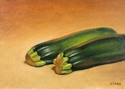
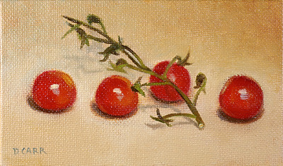
9/7: Cherry tomatoes, oil on canvas panel, approx. 3x5 in. NFS

I got to thinking again about simplifying my colors, so I scraped off a few "in-betweens" that had been hanging out at the top of my palette too long, and rethought the overall arrangement. Not the simplest palette, but I'm proud I can keep within a dozen colors (how can I say good-bye to burnt sienna and cad. red light?). Here's my still-evolving evolving palette as of this painting:


From left:

flake white hue (I started playing with it recently; W&N) and titanium white (*)
cad. yellow medium (Gamblin)
yellow ocher (Williamsburg)
cad. red light (*)
cad. red medium (Gamblin)
alizarin crimson (*)
transp. oxide red (Rembrandt)
burnt sienna (Grumbacher)
burnt umber (Williamsburg)
cerulean blue (Gamblin)
ultramarine blue (*)
ivory black (W&N)
The greens are mixes, generally of yellow and ultramarine, so they begin life down in the main mixing area next to my mixed browns - which feels perfect to me, as in the natural world greens and browns are usually found together. I used to have a tube green up top, but found it unnecessary most times. The brown mess in the middle is my general coffee-mud made up of ocher, transp. oxide red and burnt umber, and lately has been the color I start laying out with.

The palette itself is a glass piece that I've had since school, and which has a manila folder on the backside right now. It used to have brown paper taped to the back to mix my colors against, but I realized it made little sense when I didn't always start my paintings with middle- to dark-value brownish grounds. In one of the tin cups is a 1:1:1 mix of stand oil, turpentine and damar, which has been pretty comfortable for me but I'd like to experiment more.

*Brands I'd rather not name. The other brands aren't all my preferred ones, but may have been influenced by what money I had.

Friday, September 7, 2007

Zucchini


9/6: Zucchini, oil on canvas panel, 5x7 in.

Though squashes were introduced to Europe from the New World, zucchini (courgettes) originated in Italy late in the 19th century as a result of spontaneously occurring mutations, according to the Wikipedia article. From zucca (French courge), "squash."

Thursday, September 6, 2007

Garlic


9/5: Garlic, oil on canvas panel, 7x5 in.

Old English word of the day:
gárléac [gär'-lāək]
This literally means "spear-leek" from the shape of its leaves, or cloves according to one reference. As it was mentioned in Old English texts (before the 11th century) I believe it would have referred to other Allium varieties native to Britain before it came to mean the familiar A. sativum that apparently was brought back during the Crusades.

Wednesday, September 5, 2007

Italian plums


9/4: Italian plums, oil on canvas panel, 5x7 in.

I found painting these to be really hard - so much going on on a plum's surface, and these were small (and painted smaller). I'm drawn to yellow ocher a lot, I don't know why. Maybe I feel it is earthy and safe, yet has the quality of gold and all the mythical stuff associated with it. I think it's a nice complement to the warm and cool purples here.

Old English word of the day:
plúme [plū'-mə]: plum.

Tuesday, September 4, 2007

Parsnips

parsnips
9/3: Parsnips, oil on hardboard, approx. 4x9 in.


Painted this on a long panel I made a few weeks ago, and I quite like how it turned out - sort of austere and basic, as I sometimes like things to be. And I think I managed to simplify most parts, focusing on the form and not getting all caught up in detail.

I looked up the etymology of "parsnip" and found it doesn't trace back very far: Middle English pas(se)nepe, apparently going back through Old French to Latin pastinaca (parsnip, carrot), and influenced by nepe - as the parsnip was considered a kind of turnip.

Monday, September 3, 2007

Breagha sleeping


Breagha sleeping, silverpoint on wood, approx. 5.25x4 in.

I didn't paint anything in observance of Labor Day (Sunday, actually). This drawing was from last year when my daughter was about two weeks old, one of the very few times I drew anything all year. She looks here like a little bug, as we used to call her. I always liked silverpoint though I hadn't done much since being exposed to it in school.

Sunday, September 2, 2007

Illustration Friday: "Alphabets"

9/1: Alphabets, oil on paper mounted on panel, 5x7.75 in.

The theme led me to play with having two alphabets contrasted side by side. My first (terrible) idea vaguely had Roman soldiers encountering runes carved in a rock, until my wife suggested a scene with a kid writing something. Then after seeing the August National Geographic feature on the Maya, I settled on this scene. The glyphs are of course not an "alphabet," rather logograms and syllabograms - plus, though the symbols I drew began as accurate representations, I made up most of them. Sort of blasphemous from someone who loves this stuff.

I printed out a sketch that I had scanned in and tweaked in Photoshop, then mounted it with acrylic matt medium to a canvas panel (for lack of anything else). I massed in areas with acrylic yellow ocher, then later painted with oils.