
6/8. Red onion, oil on linen panel, 7x5 in.
I began to understand just before this painting what the difference between Mars and ivory black is. I never really thought much about black, always treating it as a minor hue (though it's not really a hue) unlike in the limited palettes where it plays a very major role; sometimes I'd use it only for making an already dark color blacker. (Usually when I said "black" I meant Mars, always believing it to be darkest.) Though I say Mars is blacker overall - i.e., it's opaque and stronger - ivory black is actually blacker, i.e., darker. The main difference is that ivory black is semi-transparent. So I thought, with my palette's dark hues being transparent (or semi-), would I generally want to go to a black that is semi-transparent as well?
I assumed mixing a transparent black with already transparent darks wouldn't have any real additive effect. In fact I didn't think about the subtractive effect it would have, i.e., the paint being too oily - as can be seen in the upper background of this painting, which was the result of switching to ivory black for a mix. Putting some Mars black in it towards the bottom made it stronger, but I left it mostly as it was here because it was interesting.
Tuesday, June 10, 2008
Red onion
Sunday, June 8, 2008
Palette variation
I mentioned the other day a simplified palette that Jeff Markowsky was using in Italy. The following shows an attempt to incorporate such a palette, the result of my own peculiar thought processes.
Robert Gamblin puts palettes in three categories. I find a combination Impressionist/Renaissance palette, or at least my particular variation, appealing. Since learning from Jeff how to use a wide Impressionist spectrum, I've thought a palette should be able to approximate most other colors, hence the idea of a standard palette - I'd rather rely on the same tubed colors every time than get out different tubes for different paintings (and maybe save some money). That's just me.
I kept versatility in mind as my standard colors evolved over the past year. Most recently I added two more to the lineup that are just mixes of existing ones, so that it looked like this:
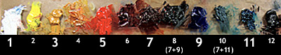
1. white
2. cad. yellow light
3. ochre
4. Indian yellow
5. cad. red medium
6. alizarin
7. transp. red oxide
8. (transp. red oxide + ultramarine) = blue-brown
9. ultramarine
10. (transp. red oxide + Prussian blue) = blue-green
11. Prussian blue
12. black
The two mixes (8) and (10) are ones I found myself using a lot, so one day I finally made big batches and tubed them. At first I disliked the idea of having a total of 12 colors again, but I came to find here a simple pattern where the odd numbered ones are dominant. And though they're no longer all pure hues, the two mixes seem pure enough (being made of strong-tinting transparent or semi-transparent hues) - and they act as variations of traditional burnt umber and viridian, perhaps.
Within each group of primaries there is a cool and a warm (one opaque and the other transparent or semi-transparent); except in the blues, both of which I suppose are considered warm, Prussian however being cooler. There are also an earth yellow (ochre), an earth red, and a cool dark earth. There's something of a system in it.
The odd-number pattern I thought would help me to simplify a little - e.g. in the very beginning stages of a painting use just (1), (3), (7) and maybe (9), and simple mixes resulting from them (with (8) being one such mix already) - except I tend to get ahead of myself when painting and haven't been able to stick to that plan. Still, the idea was an interesting one.
Robert Gamblin puts palettes in three categories. I find a combination Impressionist/Renaissance palette, or at least my particular variation, appealing. Since learning from Jeff how to use a wide Impressionist spectrum, I've thought a palette should be able to approximate most other colors, hence the idea of a standard palette - I'd rather rely on the same tubed colors every time than get out different tubes for different paintings (and maybe save some money). That's just me.
I kept versatility in mind as my standard colors evolved over the past year. Most recently I added two more to the lineup that are just mixes of existing ones, so that it looked like this:
1. white
2. cad. yellow light
3. ochre
4. Indian yellow
5. cad. red medium
6. alizarin
7. transp. red oxide
8. (transp. red oxide + ultramarine) = blue-brown
9. ultramarine
10. (transp. red oxide + Prussian blue) = blue-green
11. Prussian blue
12. black
The two mixes (8) and (10) are ones I found myself using a lot, so one day I finally made big batches and tubed them. At first I disliked the idea of having a total of 12 colors again, but I came to find here a simple pattern where the odd numbered ones are dominant. And though they're no longer all pure hues, the two mixes seem pure enough (being made of strong-tinting transparent or semi-transparent hues) - and they act as variations of traditional burnt umber and viridian, perhaps.
Within each group of primaries there is a cool and a warm (one opaque and the other transparent or semi-transparent); except in the blues, both of which I suppose are considered warm, Prussian however being cooler. There are also an earth yellow (ochre), an earth red, and a cool dark earth. There's something of a system in it.
The odd-number pattern I thought would help me to simplify a little - e.g. in the very beginning stages of a painting use just (1), (3), (7) and maybe (9), and simple mixes resulting from them (with (8) being one such mix already) - except I tend to get ahead of myself when painting and haven't been able to stick to that plan. Still, the idea was an interesting one.
* * *
Jeff told me of the Florence palette consisting of: white, Naples yellow, ochre, raw sienna, vermillion, cobalt blue, and black - useful for figure painting, but not a color scheme I ever used. I knew I couldn't stick to such a limited palette, but I wondered if I could make it work with my own - that is, not simply add new colors from tubes (only three here are new), but create those colors out of my colors; the new additions would automatically mesh with the larger group this way. So really it wouldn't be about making a different color palette, but an exercise in exploiting the original palette better.
I thought if a paint manufacturer can simulate colors like Naples yellow, then so could I:
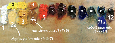
Here the numbers are the same as above with emphasis now on the seven-color scheme just mentioned, the only actual new kids on the block being (2a), (4a) and (11a). No great changes took place, except obviously the new colors share space with their counterparts in the original lineup. I used the little space between cad. yellow light(2) and Indian yellow(4) to show how a range of bright middle yellows might exist there (the transparency of Indian yellow makes it so versatile).
A Naples yellow "hue" might be manufactured with white plus some yellow and/or reddish iron oxides, and is easy for me to replicate using ochre (a natural iron oxide) and a touch of transparent red oxide (a synthetic). Raw sienna, another natural iron oxide, can also be approximated with the red oxide and ochre, here with a tiny bit of ultramarine - this is incidentally a mix I occasionally used to use, which could be made to lean slightly towards towards green or red.
Of course these are just my versions and some people might mix them differently. And one might feel there is a sort of blasphemy going on, as you can't really get close to the "true blue" of cobalt using Prussian blue and ultramarine. I remembered the cheap student-grade tubes of cobalt blue "hue" I learned to paint with and how they contain, along with the wax fillers, a mix of white, ultramarine and phthalo blue pigments. My justification for using the slightly weaker Prussian blue for phthalo was in knowing that they are otherwise nearly interchangeable (phthalo having been invented to replace Prussian). And despite the less-than-true-blue quality, this mix (like my "raw sienna") is good because of its strong transparent components. (I'd prefer anyway not to have the bite of true cobalt on my palette, just as I wouldn't want something like a cadmium orange, as beautiful as they are.)
So what did this little exercise show? Just that I could combine two color palettes into one without a great deal of reorganization. I'm not sure yet how much better this will help me to see but it was worth doing.
I thought if a paint manufacturer can simulate colors like Naples yellow, then so could I:
Here the numbers are the same as above with emphasis now on the seven-color scheme just mentioned, the only actual new kids on the block being (2a), (4a) and (11a). No great changes took place, except obviously the new colors share space with their counterparts in the original lineup. I used the little space between cad. yellow light(2) and Indian yellow(4) to show how a range of bright middle yellows might exist there (the transparency of Indian yellow makes it so versatile).
A Naples yellow "hue" might be manufactured with white plus some yellow and/or reddish iron oxides, and is easy for me to replicate using ochre (a natural iron oxide) and a touch of transparent red oxide (a synthetic). Raw sienna, another natural iron oxide, can also be approximated with the red oxide and ochre, here with a tiny bit of ultramarine - this is incidentally a mix I occasionally used to use, which could be made to lean slightly towards towards green or red.
Of course these are just my versions and some people might mix them differently. And one might feel there is a sort of blasphemy going on, as you can't really get close to the "true blue" of cobalt using Prussian blue and ultramarine. I remembered the cheap student-grade tubes of cobalt blue "hue" I learned to paint with and how they contain, along with the wax fillers, a mix of white, ultramarine and phthalo blue pigments. My justification for using the slightly weaker Prussian blue for phthalo was in knowing that they are otherwise nearly interchangeable (phthalo having been invented to replace Prussian). And despite the less-than-true-blue quality, this mix (like my "raw sienna") is good because of its strong transparent components. (I'd prefer anyway not to have the bite of true cobalt on my palette, just as I wouldn't want something like a cadmium orange, as beautiful as they are.)
So what did this little exercise show? Just that I could combine two color palettes into one without a great deal of reorganization. I'm not sure yet how much better this will help me to see but it was worth doing.
Subscribe to:
Comments (Atom)

