
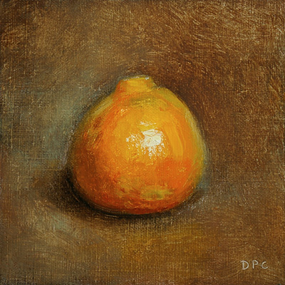
12/15. Clementine #2, oil on linen panel, 4x4 in.
I've been using Indian yellow to punch up the yellows and oranges a little. I suppose using cad. red light or cad. orange might get similar results, but the subtler transparence of Indian yellow is much nicer than the overly intense blaze you get from an opaque cadmium. And although you can make a decent orange by combining cads. yellow and red together, they are never intense enough - the reason being that opaque colors only call attention to the amount of paint that's there, while transparency keeps the focus on the hue and the light, at least giving the effect of more intensity (if not actually increasing it). So I've found that by throwing some Indian yellow in the mix I can reduce the use of cadmiums quite a bit, and get a clean color that isn't too hot.
Tuesday, December 18, 2007
Clementine #2
Subscribe to:
Post Comments (Atom)


1 comment:
Dan,
As a watercolorist, I love Indian and Naples yellows. Venetian and Indian reds, too. But I HATED cads. Very boring pigments.
Now with oil, I'm gradually following the same path. I find cads are still without character.
Glad to hear your thoughts on this subject too. Have you tried Naples yel?
Post a Comment