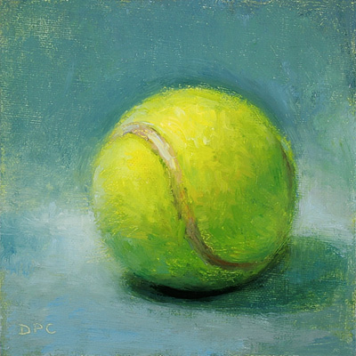
1/22. Tennis ball, oil on linen panel, 4x4 in. SOLD
It always amazes me how a color can seem "off" yet still read as the color you're after. With just the yellows and blues on my palette - cad. yellow med., Indian yellow, ultramarine and Prussian blue - I quickly saw there was no way to match the bright, acidic green of a tennis ball. But of course there wasn't, nor should there be. (Who wants that radioactive glow in a painting?) As I should have learned from the time I tried to match the orange-red of a carrot, painting is a process of translation.
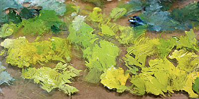
A few of my "failed" yellow-green mixes below, though I didn't think they were very bright, proved to be really good matches. Once I got the color out of the way, this became simply an exercise in rendering a sphere.
Wednesday, January 23, 2008
Tennis ball
Posted by
Dan P. Carr
at
6:27 PM
![]()
Tags: daily painting, palette, sports
Subscribe to:
Post Comments (Atom)


3 comments:
and yet... it really does look like that bright acidic green!
Well translated, Dan!
Great workmanship.
Thank you Jason.
Austin, thanks for checking me out! Best of luck with your blog - glad you are also no longer "intermittent".
Post a Comment