Saturday, August 23, 2008

Elephant Garlic, and Color in Old English (Part 1)

Elephant garlic
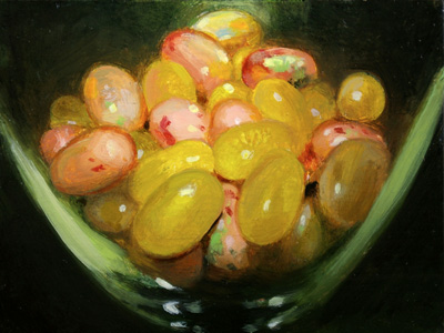
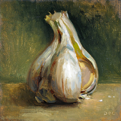
7/13. Elephant garlic, oil on linen on panel, 5x5 in.

Lately as I struggled to mix the right colors - say, decent shades (or tints?) of neutral gray - I would think about what I "knew" so far of how English-speaking people a thousand years ago would have thought of colors. I had a vision of their world (or the world they wrote about) that was tainted by all I had read on the subject, and I'd accepted the view put forth by some scholars that Old English color terms not only stressed brightness over hue, but also denoted aspects of surface texture or reflectivity. Basic-level color names then were taken to mean also dull or glossy or shining or glimmering, and so on and so on - to the point that I carried around this image of an "ideal" Anglo-Saxon world that was in half-shadow yet had very clear glints here and there of spearpoints, flickering sword edges, and dull-gleaming helmets - a diorama whose details were sharply defined though kept at an unfathomable distance behind layers of dark, honeylike varnish. Just reading about anything related to Old English felt like focusing a microscope on an amber-encased world of smoky, raucous mead halls on one hand and silent, glittering swans on the other; a world of shimmering gold and ivory contrasted against bloodstains and dark, colorless ocean.

So in that world, somehow "brown" (brún) when talking of metal could also be translated as "shining" or "bright" or "flashing," the actual hue of a brown (and dark) sword often being disregarded even by some recent translators in favor of some shine-oriented meaning. Examples from Beowulf:

seax getéah / brád, brún-ecg
"drew her knife, broad and bright-edged" (E. Talbot Donaldson, 1966)
"pulled out / a broad, whetted knife" (Seamus Heaney, 2000)

sío ecg gewác / brún on báne
"the edge failed, bright on the bone" (Donaldson)
"the blade flashed and slashed" (Heaney)

brún-fágne helm
"the bright-shining helmet" (Donaldson)
"the burnished helm" (Heaney)

How could the color brown, which was often used as a synonym for dark even into modern English, also mean bright? (It was just part of an evolutionist theory of color perception, as I'll get to below.) One etymological explanation was that there might have been confusion at some point in the evolution of the Germanic word with a similar sounding verb meaning "to burn/fire," which could have resulted in brún having two opposite meanings. But if, as in these examples, the word suggested that objects of weaponry and armor had been burned or fired, then the resulting appearance would still be dark and not bright. A more down-to-earth explanation is that brown actually described the dark coating on steel that had undergone the process of "browning" to make it less vulnerable to rust. So it seems it was a hue term after all. And as it does today, brown ranged into lighter hues such as that of parchment, though it wasn't until the 18th century that it earned a place among "basic" colors and was no longer a subcategory of black.

I summarize this last bit from a great book, Earl Anderson's Folk-Taxonomies in Early English (2003), which is chock full of this kind of semantic analysis - I love the interlibrary loan system, by which you can get your hands on expensive books on arcane subjects for only the cost of postage, like it was a movie from Blockbuster; and Google Books, where I found the book in the first place (and where you can
read much of it for free). I can't go too far before it just shows my need to read more, but for background I'll attempt to paraphrase some of it here.

Anderson defines a folk-taxonomy as "a hierarchical semantic system that lexicalizes a domain in human experience or in nature, such as colors, plant and animal life forms, seasons of the year, directions, or the senses." So, speaking of the semantic field of color (as our culture thinks of it), at the top of the hierarchy would be the taxonym, or general term, "color." At Level I are the so-called basic color terms, followed by Level II secondary color terms, Level III specialized colors, and so on. Following Anderson's example:
(0) Taxonym - color
(1) Level I, basic - black, white, red, green, yellow, blue, brown, gray, purple, orange, pink, and possibly silver
(2) Level II, secondary -
crimson, scarlet, vermillion as species of red
maroon as species of red or brown
magenta as species of red or purple
aquamarine, turquoise as species of green or blue
etc.
(3) Level III, specialized -
Compounds like blue-green, red-orange, etc.
Comparative expressions like ash(-gray), chestnut, fireman-red, mahogany, etc.
Terms restricted to specialized semantic fields, like auburn, blonde, brunette; bay, palomino, pinto, roan, sorrel; ruddy, sallow, wan, etc.
(4) Level IV, more specialized, commercially coined terms used in automobile, cosmetics and paint industries, etc.
We are familiar with the notion of a supposedly "scientific" and unbiased color space representing hue, brightness, and saturation, but as Anderson sees it, "The scientific account is really just a refined elaboration of the modern western European concept of color." He adds that terms such as "piebald, pinto, and palomino cannot be described in terms of the scientific account of color. The expected response to this objection is that these are the names of patterns, not colors, but this is really only a way of marginalizing data that are inconsistent with a preconceived theory." He cautions that when trying to interpret an unfamiliar color system, it may not always be possible to make neat correllations to our way of seeing: "It might be misleading to assume that color terms in Old English are always lexicalizations or 'mappings' of the canonical trinity of hue, brightness, and saturation."

According to "mapping" theory, "languages are 'maps' of reality, and, although these 'maps' may differ from each other, they all relate to the same reality." Such a theory "assumes the intertranslatability of languages, such that anything said in one language can be said in another" - but anyone who knows a second language or has tried to translate between the languages of significantly different cultures knows this isn't true. Anderson therefore suggests that a language works not as a map of our universe, but of a sort of parallel universe. "Words do not relate directly to things as symbolic mappings, but they relate to each other in semantic patterns and systems that are approximately parallel to the interrelation of things in reality." We may also believe in the sufficiency of our language, but, however large a language's color vocabulary, there will always be a "poverty of names;" no language is sufficient enough to communicate everything and leave no semantic gaps.

To the hue-brightness-saturation color model, Anderson adds a fourth aspect: "focality." Folk-taxonomies (colors, plants, animals etc.) aren't all-inclusive hierarchies "capable of 'containing' all conceivable instances of a given category." Although, like scientific taxonomies, they are attempts to impose order on a messy world, they belong to linguistics and not science. He argues that the mind is less like a container and more like a searchlight, so we seek the places on which to focus. Focalizations vary across cultures, and across time, as the result of changes in material culture and the influence of other languages. Some cultures today focalize more or fewer basic colors than we do, and Anderson notes for example that Russian has two basic terms for blue, a "dark blue" and a "sky blue," both having equal significance in the color taxonomy (i.e., neither is a subcategory of the other); Hungarian has two reds, "a light red with a focus on orange-brown" and "dark red with a focus close to purple." Many cultures have what we call macrocolors, or more than one color categorized as one - the Dani people of Papua have only two basic color terms, a "macroblack" and "macrowhite."

Anderson says, however, that "the scientific account [of hue-brightness-saturation] is an excellent representation of concepts underlying the folk-taxonomy of color in modern English." So it is useful to us as a means to compare, e.g., the Old English color system with our modern English one. But again, we go wrong if we think that our only problem lies in matching names. That is, despite the familial relation between modern and Old English, our modern map* isn't congruent with the old one.... And this takes me back to what I had previously considered true about Old English colors. Today it is still assumed that the Old English terms stressed the colors' brightness/darkness or surface components, but why was that? And, on the other hand, so what? - I mean, how does changing from this incorrect interpretation ultimately affect how we see their colors?...

__________
*On the subject of maps, it is interesting to see how the Enlightenment gridwork system of cartography used by Lewis and Clark differed from the method used by the Indians they encountered. One system gives a direction-oriented and supposedly all-inclusive view from above, the other a route-oriented diagram showing many directions at once as well as relative distance and the importance of landmarks encountered along the route (features shared by today's subway diagrams).

Friday, July 25, 2008

Mangosteen

Mangosteen
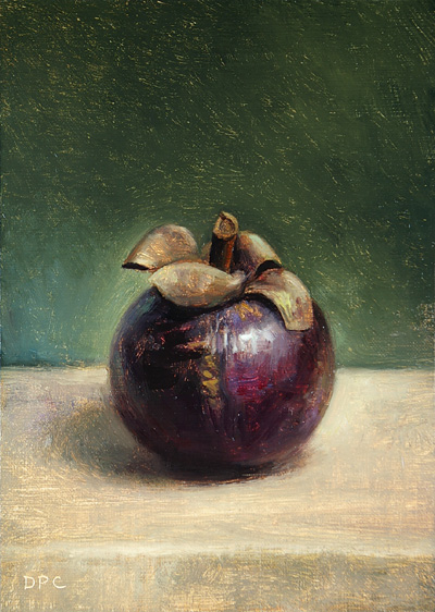
6/12. Mangosteen, oil on linen on panel, 7x5 in. SOLD

I do realize how annoying it can become to see blogs you've gotten familiar with sit untouched for a long time, so I'm going to tell myself to snap out of it and get back to posting. (I blame my inner recluse, again, and will try harder to keep the little bugger from climbing back into my head through the broken back window when it's dark. Once he's in there he's quite the tyrant.)

We noticed mangosteens at our Kroger store one day and I just had to get some. Over a decade ago, during my last visit to relatives in Indonesia, I tasted this out-of-this-world fruit for the first and only time, fresh off a tree. I think they grew on a tree but I may be remembering wrong, as the memory would become like a vision and the taste like a legend completely detached from the reality of the experience. It probably makes sense that, after all the excitement of finding them in an American supermarket then getting to cut one open for my wife to finally be able to taste these mysterious things that I had for years been unable to describe in words, I (and she) was a bit disappointed. Maybe it was because they hadn't come to room temperature, or that they were mangosteens from Thailand and maybe different from the ones I had in Indonesia. And it didn't help that it cost $10 for only four of them. Don't get me wrong, they are fantastically and exotically tasty (or tastily exotic?), and to my two-year-old daughter they will always be exotic because honestly I don't see us spending that kind of money again anytime soon on fruits that don't contain much actual edible fruit. But to my wife, because I had spoken of them so often so mythically, they were only just so-so. Wanting to understand better all this hubbub over mangosteens, she looked around on the Internet and landed on this amusing article. Thank god we didn't pay $22.95 for two.

So it was maybe because I had this disappointment fresh on my mind, or I was worried that it was too expensive a fruit to have sit unrefrigerated for too long, but I think I began the painting hurriedly and ended up laboring too much on it, getting caught up in the shell-like hardness of the skin and the shifting colors. Not that it doesn't capture the feel of a mangosteen, but I feel the painting was slightly tainted by my feelings toward the thing.

Perhaps it was fortunate that at about this time I did some more little pieces for
Cameron Gray (his new show at Robert Berman Gallery in Santa Monica opens tomorrow the 26th). It's interesting to see where my little tiles end up within a picture - in this piece from March (click "all sizes"), one of the more explicit ones forms the bright white of the girl's right eye. In all there are six tiles of mine - here's one detail. (Thanks to "C-Monster" for those Flickr photos.) Some of the recent ones, more innocent:
painting for cam i am painting for cam i am painting for cam i am
If I were teaching I might give students small challenges like these (working from reference photos), to help stay/get "fresh." I was amazed this time by how much quicker I was able to arrive at new color mixes, ones very different from what I'm normally used to. Serious "play" I guess.

Thursday, June 26, 2008

Easy (rotisserie) chicken noodle soup recipe

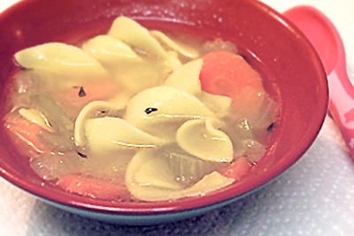
Rotisserie chicken noodle soup

Grocery store rotisserie chickens are a pretty good deal, considering that you can get a lot of use even from their scraps. Here's a simple recipe, culled from several sources, for when that chicken in your fridge is on its last legs. Overall time if I figured it all correctly: 50-55 minutes.

Once in a while I love a cool and challenging recipe, but I'm no gourmet - more like a lazy (and cheap) gourmand. This chicken noodle soup is so easy I daresay any yahoo can make it and come off looking like a fancy-pants. To date it's the only kind I've attempted from scratch, or mostly from. What's great about this method is that it cuts out the hours-long process of making a proper stock, but it tastes like you spent all day and is more satisfying than I can describe. I've made it quite a few times now and I'm proud to say my two-year-old absolutely loves it (and loves to get it all over her). If you like, you can add to it whatever half-empty bag of veggies happens to be sitting lonely in the freezer. It's about leftovers and is really versatile, you get the idea....

Note: This soup isn't exactly diet-friendly as it leaves in all the yummy goodness (=fat). To take half the day letting it cool so you can skim off the fat would defeat the purpose of this "fast" recipe.

Ingredients:

1 leftover store-bought rotisserie chicken
½ bag (6 oz.) extra wide egg noodles
2 quarts chicken broth (boxed/canned or from bouillon) + 1 quart water
2 big onions, diced
2 big carrots, peeled and sliced into rounds or half-rounds
2 big celery stalks, sliced
4 or more garlic cloves
2 tsp. fresh or dried thyme leaves
1 bay leaf
2 T. vegetable oil
salt and pepper
In a large stockpot, bring water and broth to a simmer over medium-high heat.

2 quarts is a lot of broth (for us) to have on hand, so I keep a jar of bouillon, e.g. Herb-Ox, or some other chicken soup base for making this recipe. If going that route, then per their directions (1 tsp. bouillon for every 1 cup water) that's 8 tsp. bouillon to make the 8 cups (2 quarts) of broth, or 2 T. + 2 tsp. bouillon. Which is just shy of 3 T., to keep things simple. Bring all of the water (3 quarts total) to a boil before adding the bouillon.

While the water is going, separate the remaining white meat from the chicken bones and skin and reserve this meat in the fridge.


To the simmering broth add the chicken bones with skin, pope's nose (or parson's/sultan's nose) and whatnot - the more chickeny stuff the yummier the soup. Drop in the bay leaf, and a couple or three or more cloves of garlic, lightly smashed (I like to throw a lot of garlic in as this is a good place to use up some of the little puny cloves that tend to accumulate). Add also 1 tsp. of the dried thyme and/or other compatible herb(s), or a couple fresh sprigs if you grow it and have some to spare. Go ahead, add whatever you think would make things yummy. Reduce heat to low/medium-low, partially cover and let simmer about 30 minutes.

Meanwhile, chop up the onions, carrots, and celery; mince the remaining garlic, maybe 2 cloves. (It helps me to remember the number "2" for things in this recipe: quarts of broth, onions, carrots, etc.) Set all this aside, but here if you have any usable onion scraps, or those little center stalks of celery and especially the celery leaves, make sure to add those to the pot.

When the broth has cooked and become extremely yummy-smelling, pick out the larger bones and scraps, then carefully strain it through a colander into a large container or second pot (I line the colander with paper towels to help filter). Set this broth aside. Return main pot to the burner with heat raised to medium/medium-high.

Add oil, then the onions, carrots, and celery. Season well with salt and/or pepper. Stirring often to avoid browning, sauté until it just begins to soften, about 7-8 minutes; with a couple of minutes left add the minced garlic. Don't cook longer than this or the onions will become too sweet (you want only a hint of sweet).

Return broth back to the pot and bring back up to a boil. Add the egg noodles and boil according to the directions on the package, usually about 8 minutes. (If adding other vegetables I would probably do so at this point.)

Turn off heat, stir in the reserved chicken meat and remaining thyme leaves, and let it all hang out and become yummy together until it's time to eat.

Serves 8.

Tuesday, June 10, 2008

Red onion

Red onion
6/8. Red onion, oil on linen panel, 7x5 in.

I began to understand just before this painting what the difference between Mars and ivory black is. I never really thought much about black, always treating it as a minor hue (though it's not really a hue) unlike in the limited palettes where it plays a very major role; sometimes I'd use it only for making an already dark color blacker. (Usually when I said "black" I meant Mars, always believing it to be darkest.) Though I say Mars is blacker overall - i.e., it's opaque and stronger - ivory black is actually blacker, i.e., darker. The main difference is that ivory black is semi-transparent. So I thought, with my palette's dark hues being transparent (or semi-), would I generally want to go to a black that is semi-transparent as well?

I assumed mixing a transparent black with already transparent darks wouldn't have any real additive effect. In fact I didn't think about the subtractive effect it would have, i.e., the paint being too oily - as can be seen in the upper background of this painting, which was the result of switching to ivory black for a mix. Putting some Mars black in it towards the bottom made it stronger, but I left it mostly as it was here because it was interesting.

Sunday, June 8, 2008

Palette variation

I mentioned the other day a simplified palette that Jeff Markowsky was using in Italy. The following shows an attempt to incorporate such a palette, the result of my own peculiar thought processes.

Robert Gamblin puts palettes in three categories. I find a combination Impressionist/Renaissance palette, or at least my particular variation, appealing. Since learning from Jeff how to use a wide Impressionist spectrum, I've thought a palette should be able to approximate most other colors, hence the idea of a standard palette - I'd rather rely on the same tubed colors every time than get out different tubes for different paintings (and maybe save some money). That's just me.

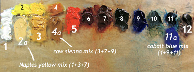
I kept versatility in mind as my standard colors evolved over the past year. Most recently I added two more to the lineup that are just mixes of existing ones, so that it looked like this:

palette May '08

1. white
2. cad. yellow light
3. ochre
4. Indian yellow
5. cad. red medium
6. alizarin
7. transp. red oxide
8. (transp. red oxide + ultramarine) = blue-brown
9. ultramarine
10. (transp. red oxide + Prussian blue) = blue-green
11. Prussian blue
12. black

The two mixes (8) and (10) are ones I found myself using a lot, so one day I finally made big batches and tubed them. At first I disliked the idea of having a total of 12 colors again, but I came to find here a simple pattern where the odd numbered ones are dominant. And though they're no longer all pure hues, the two mixes seem pure enough (being made of strong-tinting transparent or semi-transparent hues) - and they act as variations of traditional burnt umber and viridian, perhaps.

Within each group of primaries there is a cool and a warm (one opaque and the other transparent or semi-transparent); except in the blues, both of which I suppose are considered warm, Prussian however being cooler. There are also an earth yellow (ochre), an earth red, and a cool dark earth. There's something of a system in it.

The odd-number pattern I thought would help me to simplify a little - e.g. in the very beginning stages of a painting use just (1), (3), (7) and maybe (9), and simple mixes resulting from them (with (8) being one such mix already) - except I tend to get ahead of myself when painting and haven't been able to stick to that plan. Still, the idea was an interesting one.

* * *

Jeff told me of the Florence palette consisting of: white, Naples yellow, ochre, raw sienna, vermillion, cobalt blue, and black - useful for figure painting, but not a color scheme I ever used. I knew I couldn't stick to such a limited palette, but I wondered if I could make it work with my own - that is, not simply add new colors from tubes (only three here are new), but create those colors out of my colors; the new additions would automatically mesh with the larger group this way. So really it wouldn't be about making a different color palette, but an exercise in exploiting the original palette better.

I thought if a paint manufacturer can simulate colors like Naples yellow, then so could I:
palette variation June '08
Here the numbers are the same as above with emphasis now on the seven-color scheme just mentioned, the only actual new kids on the block being (2a), (4a) and (11a). No great changes took place, except obviously the new colors share space with their counterparts in the original lineup. I used the little space between cad. yellow light(2) and Indian yellow(4) to show how a range of bright middle yellows might exist there (the transparency of Indian yellow makes it so versatile).

A Naples yellow "hue" might be manufactured with white plus some yellow and/or reddish iron oxides, and is easy for me to replicate using ochre (a natural iron oxide) and a touch of transparent red oxide (a synthetic). Raw sienna, another natural iron oxide, can also be approximated with the red oxide and ochre, here with a tiny bit of ultramarine - this is incidentally a mix I occasionally used to use, which could be made to lean slightly towards towards green or red.

Of course these are just my versions and some people might mix them differently. And one might feel there is a sort of blasphemy going on, as you can't really get close to the "true blue" of cobalt using Prussian blue and ultramarine. I remembered the cheap student-grade tubes of cobalt blue "hue" I learned to paint with and how they contain, along with the wax fillers, a mix of white, ultramarine and phthalo blue pigments. My justification for using the slightly weaker Prussian blue for phthalo was in knowing that they are otherwise nearly interchangeable (phthalo having been invented to replace Prussian). And despite the less-than-true-blue quality, this mix (like my "raw sienna") is good because of its strong transparent components. (I'd prefer anyway not to have the bite of true cobalt on my palette, just as I wouldn't want something like a cadmium orange, as beautiful as they are.)

So what did this little exercise show? Just that I could combine two color palettes into one without a great deal of reorganization. I'm not sure yet how much better this will help me to see but it was worth doing.

Thursday, June 5, 2008

Avocado #4

Avocado #4
6/3. Avocado #4, oil on linen panel, 5x7 in. SOLD

I don't have a good studio set-up with sunlight through a window; I had constructed a thing recently sort of like a photographer's macro light box/tent, using a white cloth to soften the light - something I had been thinking about coincidentally about the time I read
Paul's comment way back - but I can't say yet how effective it is. Here I shone my lamp through a white trash bag.

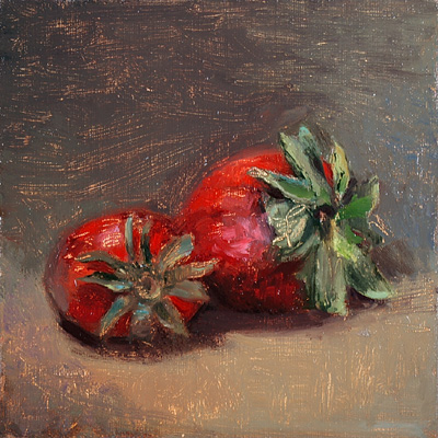
Strawberries

Strawberries (in progress)

Strawberries (in progress)

Strawberries
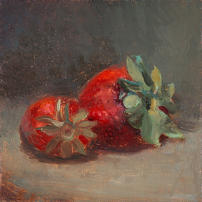
5/19 - 5/22. Strawberries, oil on linen panel, 5x5 in.

These strawberries were still only halfway posted in "draft" limbo, when I saw the other day that my old teacher Jeff had done some as well. I can't say how good it feels to see his paintings online. It really takes me back. Not that he paints the same as I remember - in fact he described his recent Florence-influenced palette to me and it got me thinking differently about my own thinking. With Gary online as well I said it felt like we are walking the same halls again. The Internet is wonderful.

This painting is not illustrative of any new thinking, but rather how I haven't been doing much thinking while painting. I decided to take the in-progress shots of this piece when as soon as I realized I was having trouble with it, and if this is any lesson it shows how one could do things better in the beginning. These sessions were perhaps under a couple of hours each, plenty of time really, but the first night I failed to get the shapes right and I wasn't paying attention to even the basic light and shadow masses of the strawberries. Plus I got too much white/grey in everything.

The next night I tried to do better but still lacked focus - if you're like me, you sometimes do something without being wholly aware along the way, especially when you pre-suppose it to be easy - you can't paint subconsciously and effectively, apparently (at least in my case) not strawberries. The reds were giving me a hard time as always, and I knew everything had to be drawn better and I couldn't get around that. By this time the leaves were changing shape and mold had begun to show in places, which was upsetting because this batch of giant strawberries was probably the sweetest I've ever tasted.

I wanted to abandon the piece but a couple of nights later I went back into it. This time I arrived at a better sense of the form. Things finally were feeling round and I had had enough. I touched up the shadow area a little just before taking the last photo, but managed to somehow seriously mess up the darker red parts. So I was forced to unify the whole shadow area the way I should have in the first place - and it actually looks better, even if the end product is kind of stiff I think.

Wednesday, June 4, 2008

IC14 Show

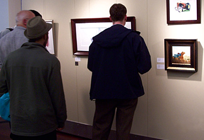
Well, back to the Illustrators Club show. The gallery that evening was packed and hot and stuffy and I was nervous and sweaty and feeling more un-photogenic than usual, so I'm not in these pictures. Really I was just happy to be there.

I am sorry that all I documented of the event centered around people looking at my piece (or not looking, as that's a gold medal winner by the awesome Greg Harlin they're admiring):

IC14 Reception

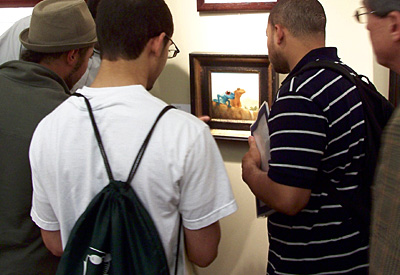
But I did catch these guys taking a closer look:

IC14 Reception

I was so proud to be in this group, knowing I was a small fish in the pond. And hey, my name was mentioned in last Friday's Washington Post review!

Wednesday, May 7, 2008

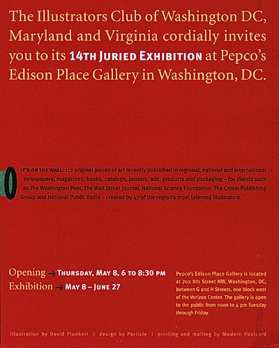
Illustrators Club show!

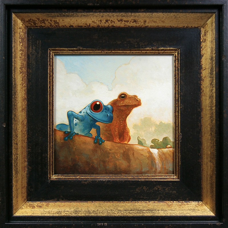
Æsop's Fable of the Frogs and the Well (framed)

Happily in the time I was "away" some good things came along, one being the news that this little piece was accepted in the
Illustrators Club of DC, MD & VA's annual juried show, and we're planning to drive up for the opening tomorrow (sorry I'm posting this at the last minute).

For now I'll say some other stuff is in the works too, which makes me think that Yeats' old crane of Gort may himself be enjoying a trout or two....

For DC area folks...

Management profoundly regrets and apologizes for the inconvenience and worries that have been caused; and Eddoes #2

Eddoes #2
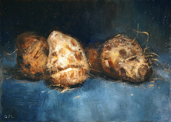
5/6. Eddoes #2, oil on linen on panel, 5x7 in.

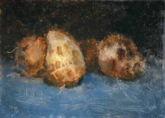
Eddoes #2, in progress
(in progress)

Well, I never thought I'd become one of those loathsome, horribly selfish people who could let their blogs languish for months with no explanation why. Originally I intended to stop for some soul-searching (whatever that means). I felt that I had been working too comfortably, that I still wasn’t getting at whatever it is I wanted to get at, if you get that. Most likely it started with my going to Charleston and seeing my friend and coming back and seeing a lot more great art online and getting annoyed with myself and with how I see (or don’t see) things. The old hermit in me said it was time to step away and hide out for a while, so I decided to put this (almost-)daily painting "project" face down and not feel too guilty about it.

I was telling myself I had to work out the composition of a new portrait of my daughter. Looking again at my old art history books reminded me of the enormous impact that Correggio, Bellini, and other Renaissance painters initially had on me, and it made me want to tackle something on a little larger scale in which I could play around more with light, do more subtle things. But I maybe just got more overwhelmed looking at more good stuff. And that portrait of Breagha never got started.

As my friend Gary put it, sometimes "life happens" - I found myself sidetracked by non-art projects (e.g. building a shoe rack for the narrow space by our front door, putting up some shelves, rearranging our computer work area). At some point though I helped do some tiny paintings for an artist in Southern California named Cameron Gray, who puts together these large mosaics with photos of body parts, food, and such things as reference (see a
past show). Here are some:

Painting for cam i am Painting for cam i am Painting for cam i am
A few of these are for a piece in a show opening July 26th from 6:30-8:30 at the Robert Berman Gallery in Santa Monica, Bergamot Station. I find/found painting these to be great practice (matching value and color), even if I normally wouldn’t force that sort of thing on myself.

My hiatus hadn't exactly been a vacation, though I must say it has been nice after the kid's in bed to once in a while spend the rest of the evening in the same room with my wife, and not at my easel. And a lot of times I would get lost in a book about falconry or abstruse Old English stuff (which relate to the portrait I want to do), but sometimes I'd just watch news and get mad at the political coverage, which just meant that I was in a worse comfort zone and that I needed to get back. Time the dragon awoke and came out of his barrow....

So, back to the eddoes above - I can’t remember when, but one night at least two months ago I had started painting them, and they then sat there patiently waiting to recapture my attention. So the other night I finished the painting - though by this time the little things had shriveled considerably (getting moldy underneath) and were sprouting real thick, sharp-looking green shoots. It was hard to overlook their present condition and rely more on my memory for some details, but I did my best.